

 Typography is a very essential part of design. Understanding the written and unwritten rules about it can enhance your projects and get your clients message across effectively. Here are some common rules to follow:
Use fewer fonts There is no magic number of fonts that should be used in a project. Creative license is there so that according to you and your clients’ preference you can use as many or as few fonts as you deem necessary. I’ve personally found that after the use of 3 fonts, your message seems to get lost as your eye tries to dart around and determine what is important to read. Keep it simple and structure your message by using fewer fonts. Show importance with font size hierarchy Simple rule, the most important text should be the biggest. The next important text should be a size lower, and so on. People’s eyes are drawn to the largest thing within your project first. If it’s an object, a word or phrase, or even a large blank space, they can sense what’s important by its size. Whatever you want people to read first, make it the biggest. Read over text even if you don’t professionally proof read I’ve always thought that it’s not my job to proofread. That’s not what I was being paid for, and I never took the time to do it. But what I realized is that when I finished a project and the design revisions had been completed, then client then started to find typos. And one word here, another word there adds up to more time on the computer correcting what should have been a finished piece. If you take the time to glance at your client’s text, even if it’s just skimming, you can save yourself a lot of time and headache later. Use sans serif fonts for large amounts of text on a website On a computer screen, the easiest types of fonts to use are sans serif. The letters in serif fonts can seem to run together, making them harder to read when the font size is smaller and cause strain to the eye. The last thing you want a client’s potential customer to do is leave their site because they didn’t have the patience to read it. Examples of sans serif fonts are Helvetica, Calibri, Arial, Corbel and Veranda. Make text alignment purposeful If you have text that runs into each other, that staggers on its edge or that is on a diagonal, make sure that it looks like you meant to do it that way. One of my art professors always used to say, whatever you do in design, make it look like you did it on purpose. One of my pet peeves is seeing text that should be left justified or right justified that doesn’t line up exactly. You can tell that they didn’t take the time to correct the alignment. Take the time to line up your text, or if you want it to be out of line on purpose, do it so much to the point of looking like a key design element in your project. Contrast between type color and background color If your background is dark red, and your important text is two shades lighter, it will get lost. Contrast creates interest and draws the eye. If you use a dark background, try a lighter text if you want it to stand out. If you want to use a similar color, try a drop shadow or an outer glow to make the text pop. Again, there are rules of typography, and in some cases those rules were meant to be broken. But breaking them should be purposeful and should enhance your design, not draw attention away from it. Following those unwritten rules will ensure that you’re graphic projects are easy to read and attracts new customers for your clients. What do you think? What are your typography rules?


I have to say that I believe in the less is more theory, I think that if one uses too many fonts it could make things look way too busy and can distract the viewer from what he or she is actually seeing, making them less interested.
I absolutely agree Penny@Calendars. Using too many fonts is distracting and, as you said, often times a turn off to the viewer.
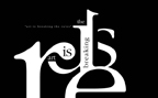
[...] day. We do it so often, that sometimes we don’t even realize it, but typography is all around us. Typography is the arrangement of fonts and text, and is involved in every single area of design that uses [...]
One has to be careful when doing and using fonts as too much can be very distracting to those that are viewing it, like Penny says less is more and this actually applies to many things in life, otherwise things are way too much on the eye.
Fonts have to be used in the right way otherwise they can be very distracting to the person viewing your page. If this happens one wont get many visits to that page or the entire site depending on if that particular font has been use throughout. A goos designer will know all about the right kind of fonts to use in order for a site to grab ones attention and not lose it.
Less is more in any place be it clothing or decorating, and especially when it comes to web site and design. This all boils down to content, the way its written the fonts used, this has to be easy on the eye of the person visiting the site, the font has to be clear, something that all people can read with ease. There is nothing worse than a font that one really battles to read, and make out what exactly is happening on that page...............so at the end of the day "LESS IS MORE"
[...] If you are hoping for a little more than the basic fare, check out these excellent plug-ins for typography upgrades. [...]
[…] If you are hoping for a little more than the basic fare, check out these excellent plug-ins for typography upgrades. […]