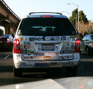
 With so many cars on the road, bumper sticker marketing provides an excellent return on your investment. Stickers are cheap to print, and once your customer slaps one on his or her vehicle, your message is spread to everyone who is caught behind the driver or passes the car in a parking lot. Here are five tips for effective bumper sticker graphic design and printing.
Consider the space. Bumper stickers don’t leave a lot of room for your promotional message, so use that space wisely. PsPrint provides free sticker templates so that you’re perfectly aware of your dimensions. Choose high-contrast colors. Your audience will spy your bumper sticker more easily if it’s easy to read. This is not the time for pastels – you want bold colors that stand out. Limit yourself to just a few colors to keep the contrast. Try a die cut. Most bumper stickers are rectangles, but you can make yours stand out by choosing a custom die cut. Think about what your business is and what image fits: I’ve seen dog bone shapes for pet stores and animal sitters as well as crosses for churches. Take it for a test drive. Print a proof of your bumper sticker and tape it onto your car. Ask a friend to drive behind you and alert you if the type is too small or the logo is undecipherable. Print with a protective coating. Cars see a lot of different types of weather, so you want to be sure your bumper sticker can withstand fading and tearing. A gloss vinyl coating will ensure your sticker looks brand new for a long time. Image via the hilarious Go Back to Berkeley website.


[...] Bumper stickers are a great marketing tool for nonprofits on a local or national level and for-profit organizations with a focus on corporate responsibility. [...]
[...] them with a couple of tweeters this month. You can choose a shape to symbolize your business for bumper stickers such as a cupcake for a bakery or a record shape for a music [...]
[...] in point: Here are six stupid bumper stickers you’d better be glad aren’t on your [...]