

Graphic design in the 1980s was loud, colorfuly, punky and in your face. Fellow PsPrint blogger Jennifer Moline has a great post on 1980s graphic design on inspiredology.com. Jennifer highlights some of the great '80s trends in slogans, advertising and logo design.
After reading her post, I couldn't help but reply with a roundup of 1980s album covers. Some of the selected covers are so obviously from the '80s that they don't stand the test of time. There are a few albums in the mix that would look chic and cool if they were released today. Please take a look and leave any of your favorite '80s album covers in the comments.
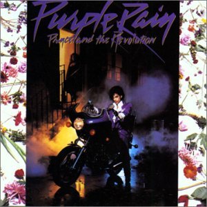 Prince & The Revolution, "Purple Rain" 1984. With the font, the flowers and the smoke-machine this album cover is totally stuck in the '80s and could never pass for a 2011 record release. [Image source]
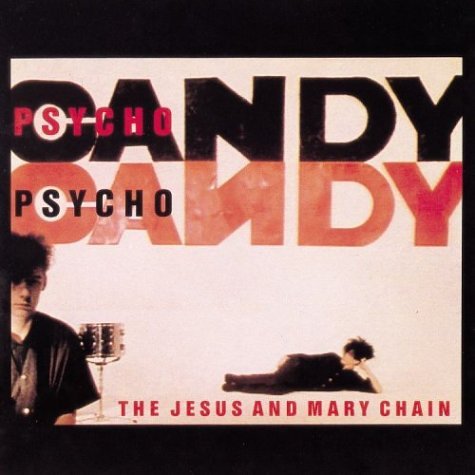 The Jesus and Mary Chain, "Psychocandy" 1985. This album is very '80s, but it's the kind of edgy '80s style that the fashion world is bringing back. I think this album cover design could work just as well in today's market. [Image Source]
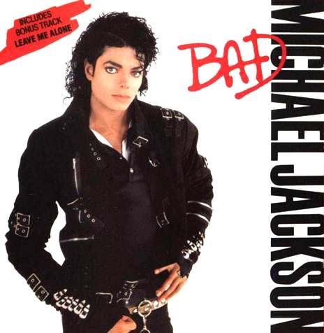 Michael Jackson, "Bad" 1987. The leather jacket and red hand-written font place this album cover most definitely in the '80s. There's no way this design could stand the test of time. [Image Source]
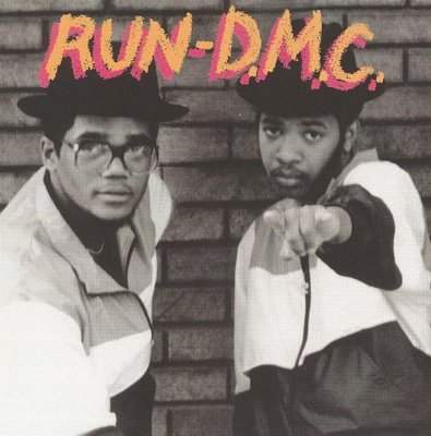 Run-D.M.C., "Run-D.MC." 1984. The clothing in this photograph is the major give-away that we're looking at an '80s release. Otherwise, this album cover design is so simple that I think it could easily pass as a '90s or early 2000s album design. [Image Source]
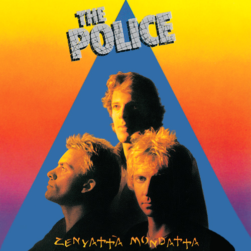 The Police, "Zenyatta Mondatta" 1980. Both font treatments and the use of primary colors (which shows up in several of these '80s album designs) really date this design. The only other decade this looks like it belongs to is the '70s. The triangle in the background is reminiscent of Pink Floyd and the new-agey '70s era. [Image Source]
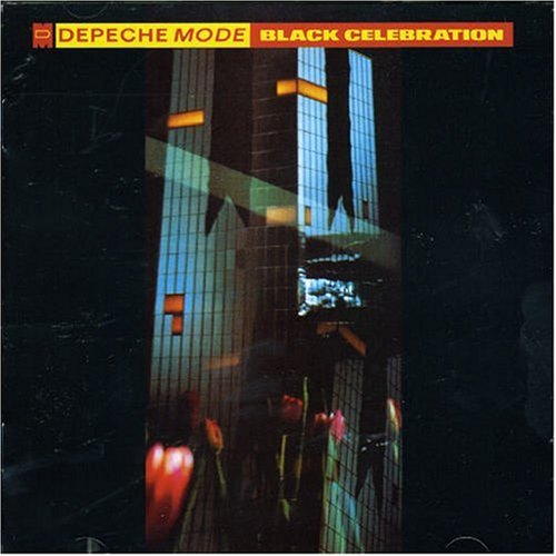 Depeche Mode, "Black Celebration" 1986. This image does stand the test of time. The design seems to be borrowing fom Jenny Holzer's "Protect Me From What I Want" installation, also from the mid-80s. [Image Source]
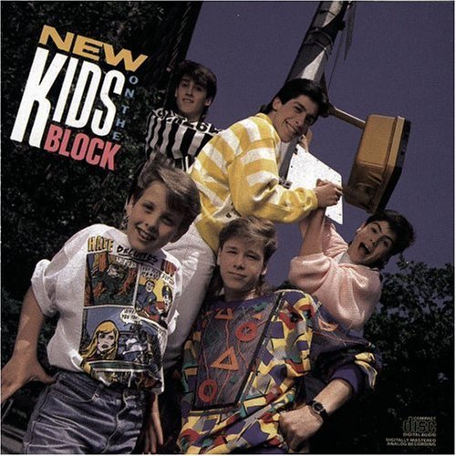 New Kids On The Block, "New Kids on the Block" 1986. Oh boy. This group jump started boy band mania in the '90s. This is undoubtedly an '80s design. The clothes, font, color choices and Reagan-era enthusiasm say it all. [Image Source]
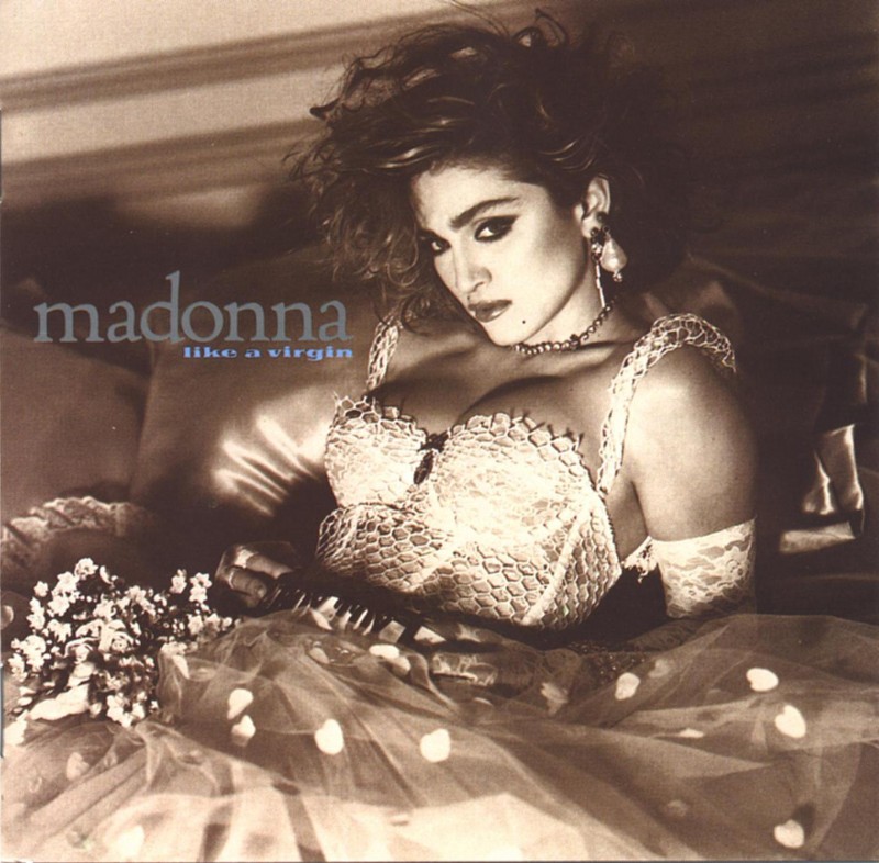 Madonna, "Like A Virgin" 1984. Madonna was always ahead of her time. This iconic '80s album cover design would still appeal to the masses today. The artful photography, great styling and perfectly placed font are timeless. [Image Source].
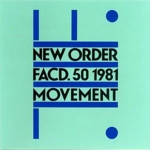 New Order, "Movement" 1981. I am on the fence about this album cover. The strange color combination kind of dates the cover to the '80s, but the font and simple layout would look stylish in any time period. What do you think? [Image Source]
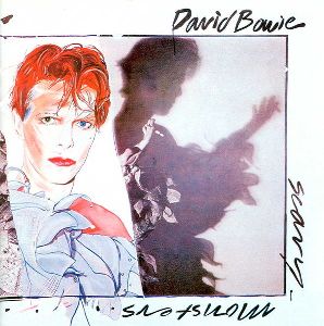 David Bowie, "Scary Monsters (And Super Creeps)" 1980. David Bowie is too cool to be relegated to a single decade. I think this strange illustration-meets-collage album cover is still appealing more than 30 years later. [Image Source]
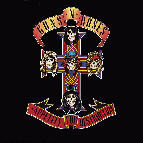 Guns N' Roses, "Appetite for Destruction." 1987. I am not sure whether this album cover stands the test of time or not. Perhaps because the album cover borrows from the classic Día de los Muertos tradition, it makes the artwork still seem relevant today. [Image Source]
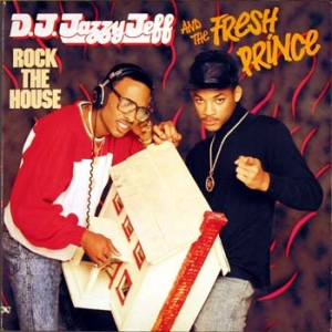 D.J. Jazzy Jeff and Fresh Prince, "Rock the House" 1987. The fonts, hot pink pattern in the background and acid-washed jeans make this an uber-80s design. This cover would not pass in any other decade. [Image Source]
 Devo, "Shout" 1984. Here's another example of an '80s album cover that uses primary colors. I think this album cover would definitely work in today's marketplace because there are still designers using pixelated fonts and images to give their work an old-school vibe. [Image Source]
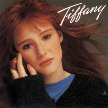
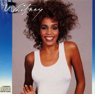
Tiffany, "Tiffany" 1987, and Whitney Houston, "Whitney" 1987. Two self-titled albums, released in the same year with a very similar design. You can almost see the wheels turning in little 6-year-old Britney Spear's mind. [Image 1 source; Image 2 source].
In case you missed it, check out this related PsPrint post on 1970s Album Covers.


Thanks for the article! It was perfect for inspiration for my designs. :)
[…] 80s design inspiration: 15 album covers […]
[…] be glad to add your works along with a backlink to your site. At the same time, please use these photography inspirations to make a memorable album […]
[…] 1980s Design Inspiration: 15 Album Covers – PsPrint Blog – Check out these 15 album covers from the 80s and see if you think they stand the test of time. […]