Fashion trends change with the seasons, and wedding trends follow right behind. Now seems like a great time to take a look at some of the biggest spring trends and use the ideas to make your invitations pop.
1. Color
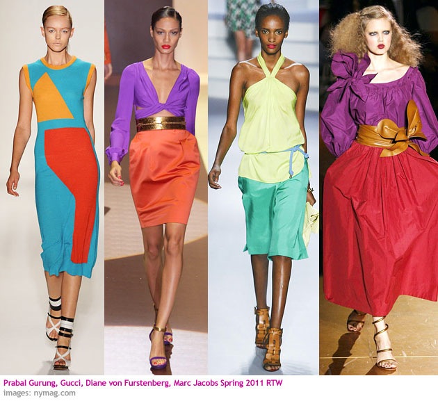
Bright saturated colors were all over the runways for spring, many of them used in combination with each other. There was the ’70s Studio 54 influence with bright berries and teals, and the ’80s fluorescents along with some sun-baked resort colors. The bold use of color lends itself to vibrant brides who really want more of a party atmosphere than a solemn occasion or for a destination wedding in a sunny locale.
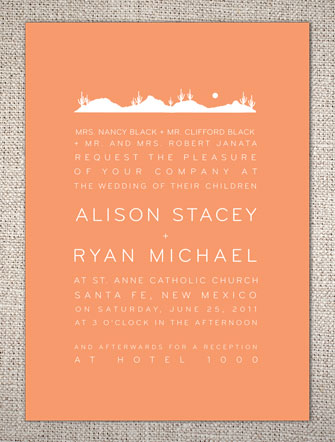
The Desert Skyline wedding invitation design is from Hello Lucky and makes good use of a typically southwestern sun-baked coral.
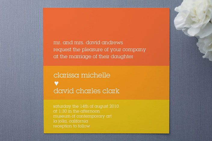
Summer Sun from Minted uses color-blocking in citrus colors.
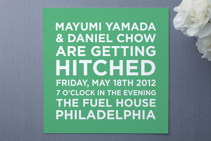
Hitched by Minted, in a fresh spearmint green, is especially unfussy and informal.
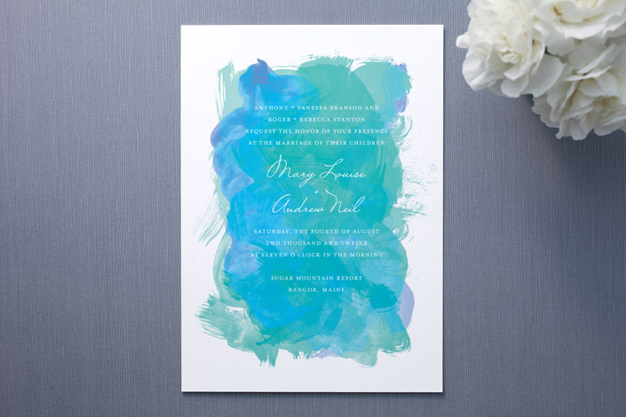
Taking a slightly more artsy approach, Aquarelle from Minted uses organic washes of color for a softer look. 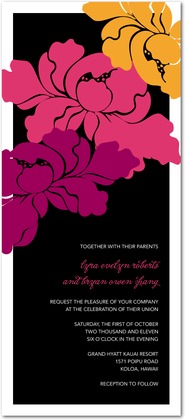 Elegant Poppies from Wedding Paper Divas recalls a ’70s deco Biba vibe. 2. Lace
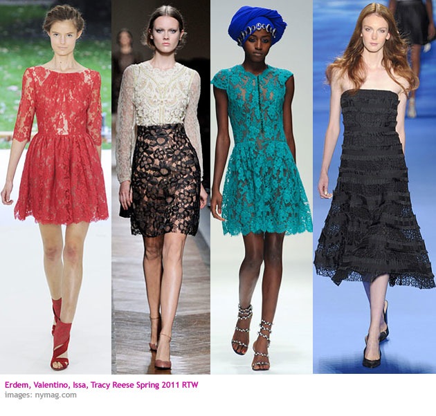 Lace, and most especially bright lace over a nude liner, was everywhere this spring. The bright color served to take away some of the little-girl sweetness of the lace. If you want to steer clear from the sugary and old fashioned, but love the intricacy of lace, bright color is a good way to modernize it.
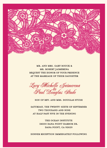 Antique Lace from Papeterie is very customizable in terms of color so the lace and border can be subtly or saturated.
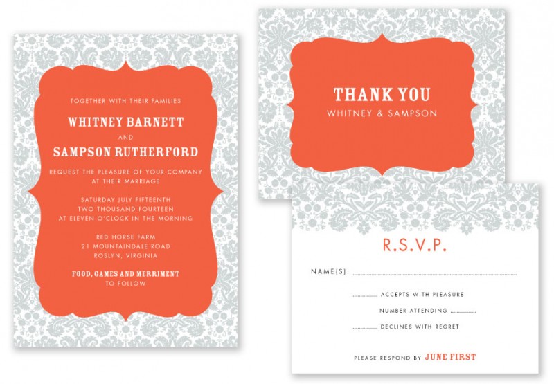
Damask from A Printable Press reserves the color for the central medallion but the effect of down-playing the sweetness is the same. 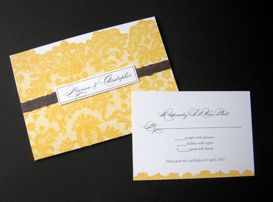 Savannah Wedding from Papel Vivo uses a sunny saffron color for the lace pattern.
 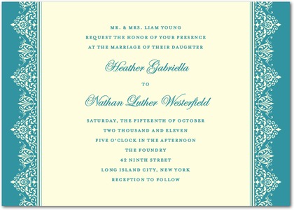 Lacy Border from Wedding Paper Divas uses turquoise to set off the detail of the cream lace. 3. Prints
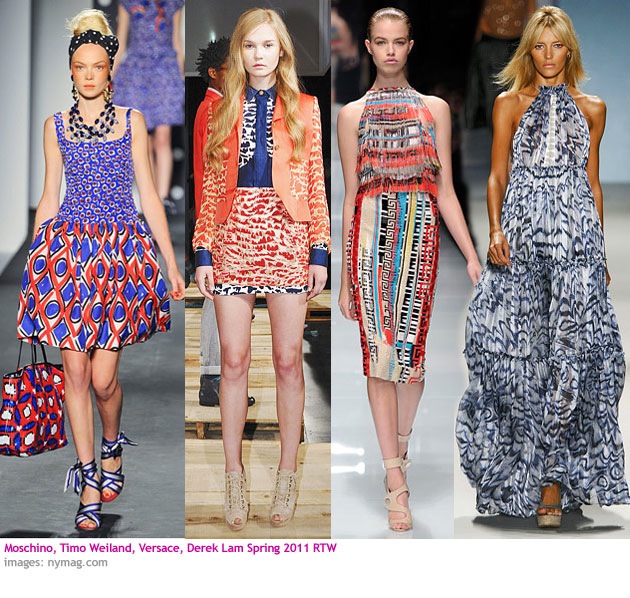 Not just prints, but specifically ethnic prints and print mixing were a big trend. Many of the prints had an organic, imperfect hand-printed quality that suggested a jet-setting bohemian style.
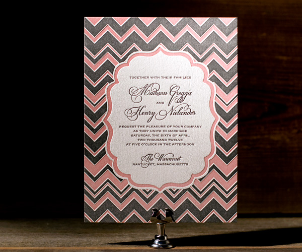
This irregular chevron print on the Darla invitation from Bella Figura has a Missoni knitwear look to it.
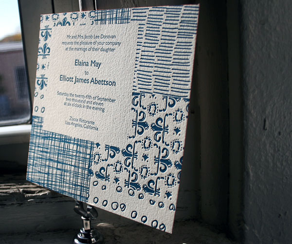
The hand-illustrated combination on Fig from Bella Figura has a very boho attitude.
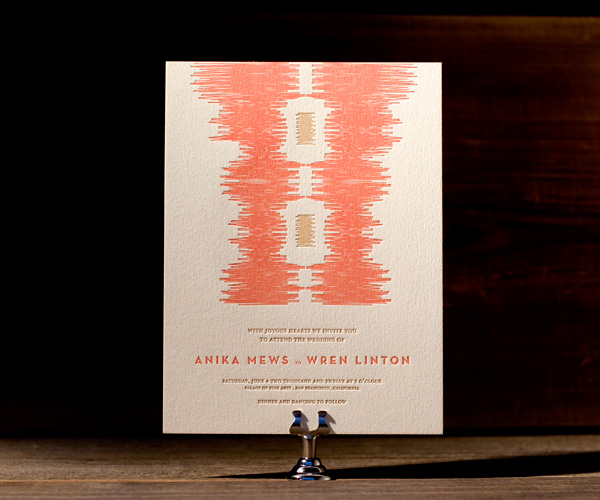
Ikat prints were popular for spring, and ikaty from Bella Figura uses the abstract motif to good effect. 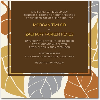 Painted Leaves from Wedding Paper Divas had the organic quality of a batik fabric
 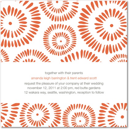 The print on Sweet Sensations from Wedding Paper Divas has the exuberant feeling of an African print.
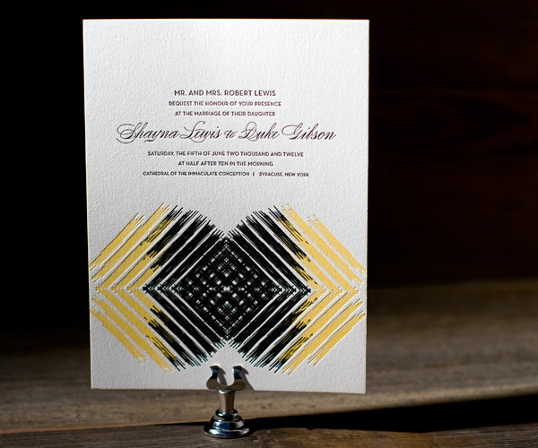
Promise from Bella Figura has a brushy quality that keeps the crossing lines from feeling too geometric. 4. Stripes
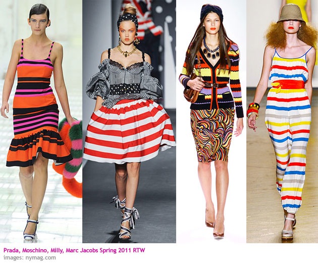 The stripes that showed up on the spring runways were not of the subtle skinny variety. Stripes were used thick, bright and variegated. The more like candy the better. Prada’s orange, fuchsia, black combo was one of the most loved, showing up on a slew of celebrities.
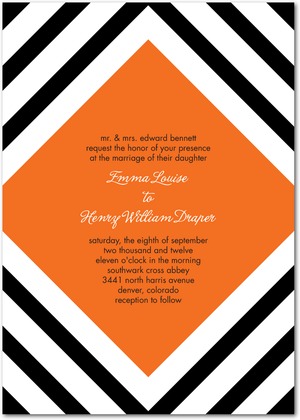 Bold Geometry from Wedding Paper Divas has a very Prada-esque combination of black stripes and juicy orange center. (The center diamond can actually be printed in a variety of other colors in case you prefer the fuchsia)
 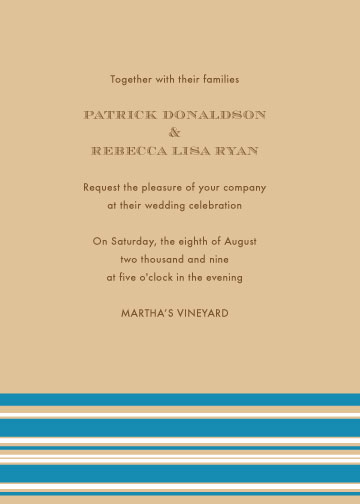 Cosmopolitan Cabana from Papeterie says it all. A very French Riviera combination of apricot and azure suggest resort without any imagery.
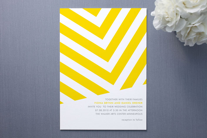
The giant sunny herringbone stripe of Fracas from Minted looks like giant patio parasols and beach towels. 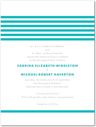 Modern Stripes from Wedding Paper Divas.
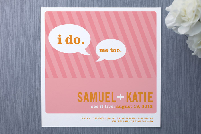
Smart Conversation from Minted. 5. White on White
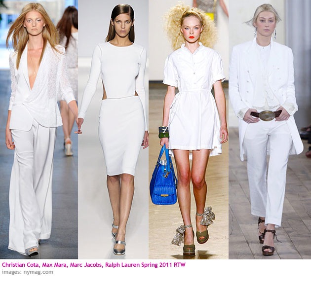 On the runways it was pure white on pure white. In terms of invitations I think it translates to a sense of minimalism, the use of white on pale or embossed texture on white paper.
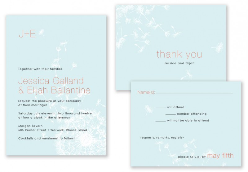
Dandelion from A Printable Press makes subtle use of blowing dandelion seeds as a pale background motif.
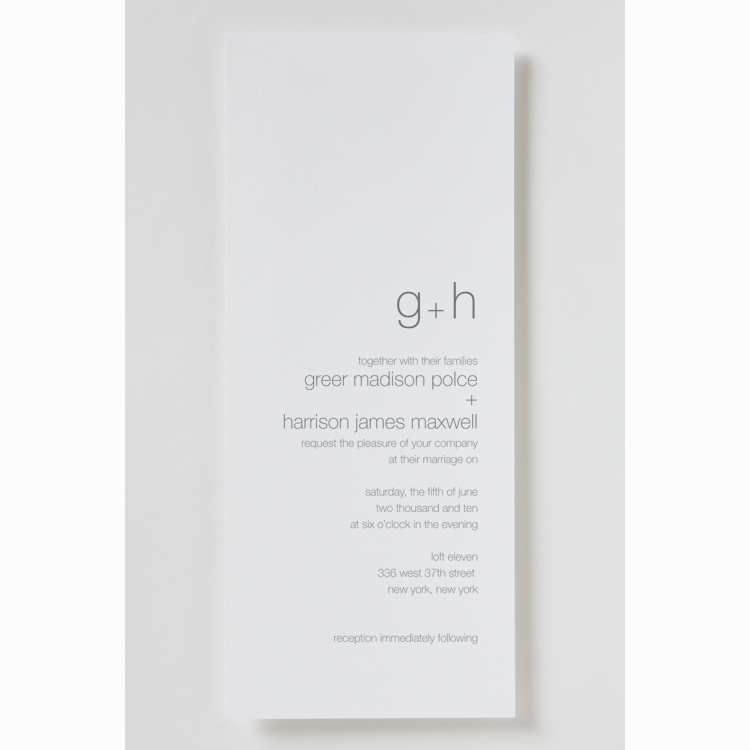
Instead of black type on white, the use of gray type on the Gwen invite from Betsey White gives it an airier feel that’s supported by the thin sans serif type. 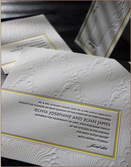
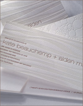
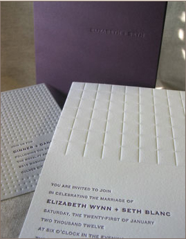
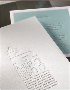 These four options from Elum (from top to bottom: La Fontaine, Lucidity, Parallel and Watermark) make great use of debossing and embossing on thick, white stock.
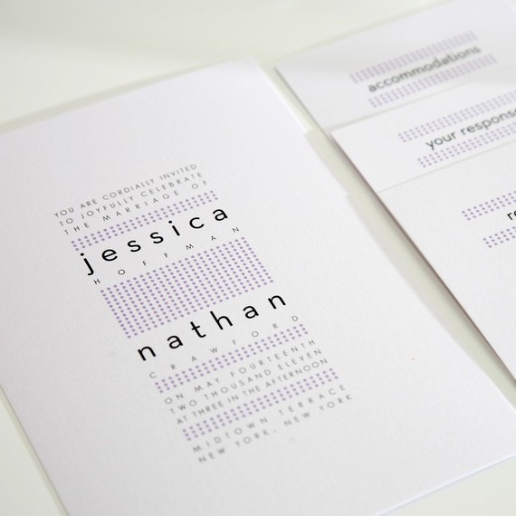
Modern Dots from Shine Invitations on Etsy keeps it clean with tiny dots and tiny type on a lot of white space.





Great post Rosie!
I loved the invitation inspiration from current fashion trends
Very well put together
Thank You!
Abi Harper
Glad you enjoyed it Abi. Fashion and design are always influencing each other and I like finding the places where they intersect.
-R
What an inspirational post! I never made the connection between Spring fashion and graphic design before- and I love all of these great ideas!
I design wedding stationery and there are some great pieces here.
This is a "gigs the couple have seen together" concept I came up with recently. Please take a look. http://on.fb.me/lu99EE