

A letterhead system is an important communication tool for your company, or (if you're an army of one), yourself. At its most basic the system should include letterhead, envelopes and business cards. It can include much more than that, but we'll cover that later. A letterhead system makes you look professional and reputable, but it can be a challenge to design for yourself. The problem and the opportunity are two sides of the same coin. On the one hand there are a lot of pieces of differing shapes and sizes that need to work together cohesively. On the other hand the different shapes and sizes allow you room to play with the elements of your identity and make the whole more than the sum of its parts. It can be hard figuring out where to start the process. Let's concentrate on the letterhead itself and explore some of the possibilities. 1. Think about the fold When designing on the computer it's easy to think of your letter as a flat piece of 8.5-inch by 11-inch, but the reality is that your letter will need to be folded into thirds to fit into a standard business envelope. You may want to consider where those folds fall on the page partly to control what the recipient sees as the letter is unfolded and partly to keep important information from falling into the creases of your letter.
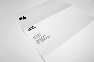
On this letterhead for Eastside Bookstore, designer Mihail Mihaylov set up the logo in the top third so that it would be the only identifying mark on the letter as it's taken out of the envelope. The business name and contact information then unfold on the middle third. The top edge of the business name can also act a folding guide to insure the top fold is always fairly consistent.
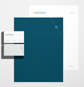
Here, Robinson Cravents designed the letterhead for B'seen with a pattern on the back. The clever corner treatment acts as a nice accent to break up the regularity of the pattern and is the first thing a recipient sees when pulling the letter out of the envelope. It also marks off the top third of the letter as you can see below.
This letterhead for B'seen brings us to our next consideration ... 2. Use the back of the letterhead to add richness to your identity Ensembles of any kind are always more interesting with a variety of textures. This is as true with an identity system as it is with an outfit or the architecture of a building. Once again, when designing on a screen it's easy to forget that a letter is a dimensional object with a front and back, both of which people are likely to see. The back of the letter can be a place where you make a pattern out of the logo or use a photograph. You can even fake a watermark by printing an image dark on the back of the paper. There will be some show-through when light hits the back of the letter making it look watermarked.
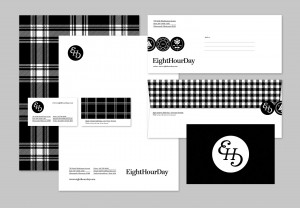
In this letterhead for design firm Eight Hour Day, a range of black and white plaid patterns play across each of the elements. The back of the letterhead carries a bold buffalo plaid that adds a lot of charm and personality to the set. Even though there isn't a drop of color it would be hard to describe the overall effect as boring or stuffy.
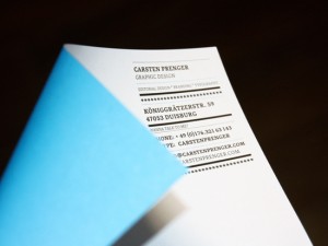
Carsten Prenger uses the back of his stationery to introduce a bold hit of cyan that he also uses on his business cards and envelopes.
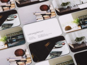
On these business cards that Studio Brave designed for Leesa O'Reily , four different images are used full-bleed on the back. There's no reason why the same idea can't be used for a letterhead. And while we're thinking about the letter in three dimensions, why don't we ... 3. Think about elements wrapping around from front to back This can take the form of a graphic such as a logo, a phrase or an applied label. The only thing I wouldn't suggest would be wrapping around small type and crucial information. It should be something bold and abstract or something that doesn't really cut off at the edge.
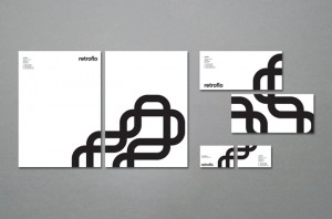
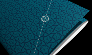
This system by Sarah Walsh for Retro Flo takes the "rf" logo from the front corner of the letterhead and literally makes it flow around to the back in a pattern by flipping, repeating and connecting it.
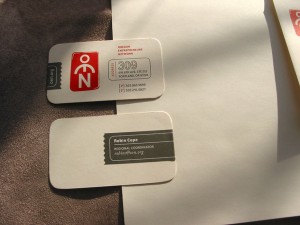
On this business card for Oregon Entrepreneurs Network, Jared Milam made the name and contact information into a sticker that could be applied, and wrapped around the side of the card. It allows the printed information on the card to be generic so that the personalization happens when an employee applies their information sticker to the card.


[...] my earlier post Letterhead Possibilities, Part 1, I gave some thought to the fold, the back of the page and the idea of wrapping around. But there [...]
[...] previous posts, Letterhead Possibilities: Part 1 and Part 2, we took a look at some considerations for how you want to brand yourself. (It’s [...]