

In my earlier post Letterhead Possibilities, Part 1, I gave some thought to the fold, the back of the page and the idea of wrapping around. But there are so many other considerations since you have to include a multitude of bits and pieces and design for both vertical and horizontal layouts. So the meat of your letterhead, namely, the contact information and company logo have to be flexible and modular. Let’s take a look at some examples of how to fit the pieces together.
Puzzle piece 1: The logo mark and/or the word mark
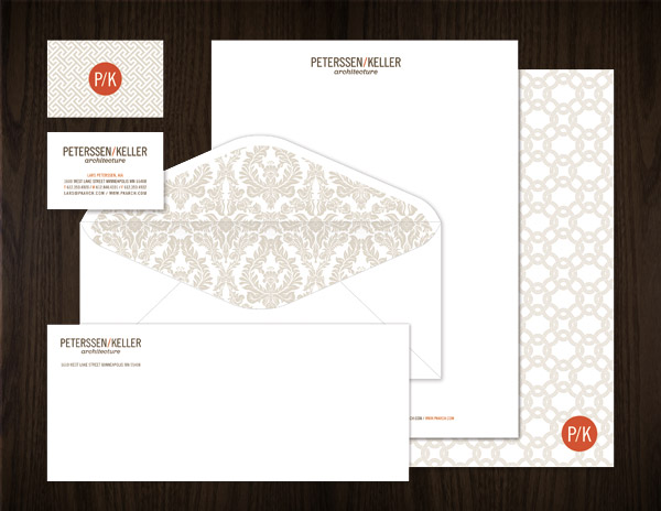 This letterhead by Eight Hour Day for Peterssen/Keller Architects makes use of both a word mark (Peterssen/Keller architects) and a logo (P/K contained in a circle). Each is used in a slightly different way. The P/K is a stamp and acts as an instant visual cue for the company. It's shorthand and is used as a bold colorful element to add some dash to an otherwise low-key system. The P/K stamp makes it possible to use the company identity multiple times without being visually repetitive (aka boring.)
 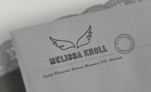 Tenfold Collective developed a flexible system for Melissa Kroll. Here we see her name combined with wings to create a memorable mark.
 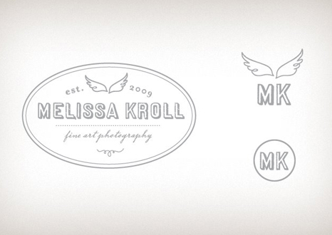 But for maximum flexibility that mark can be expanded to become a more informative stamp that spells out Melissa's occupation or contracted down to just initials and wings or, in executions where the wings won't read well, just initials. The shorthand versions act as visual crumbs. Reminding the reader of the fully expanded version without taking up the same space.
 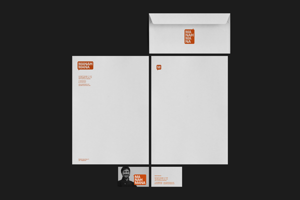 Here's a great letterhead from Spanish design agency La Caja de Tipos for experimental consultancy Manahmana. The logo itself can be stacked in two lines, three lines or four lines. This allows it to fit into horizontal, vertical and square formats without any awkwardness.
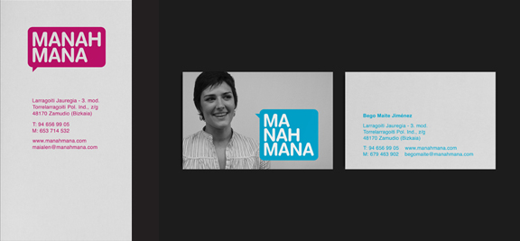
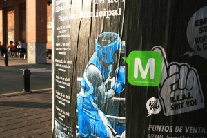 They even developed an "M" sticker that could be added collage-style to other advertisements, posters, etc., in the environment.
Puzzle piece 2: Contact information chunk
 Contact information is one of the elements that shifts in importance depending on which piece of the letterhead system it's on. On the business card it's crucial information.
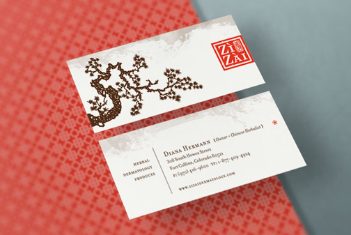
 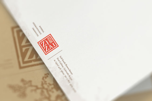 But on a letterhead it's not quite so important. The contact information is also on the envelope and is really just a secondary consideration on the letterhead. The information contained in the letter itself takes the lead in terms of importance. So this letterhead by Tenfold Collective for ZiZai dermatology treats the contact differently on different pieces. On the business card, the logo is pushed to the back to give more space for the contact information to live at a bigger point size. Whereas on the letterhead the contact dangles from the logo at a much smaller size. just big enough to read if you're looking for it but easy to ignore if you're not.
Puzzle Piece 3: Extra elements and details
If you want to stand out or make a very particular kind of impression there are elements you can add that will become part of the modular branding system. 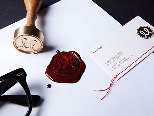 In this case The Bond agency used a sewn red thread line and a custom wax seal for Mark Mink's identity.
 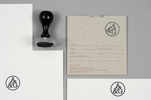 Here, Collective Approach created a custom stamp for A & G to give their logo that imperfect inky quality.
 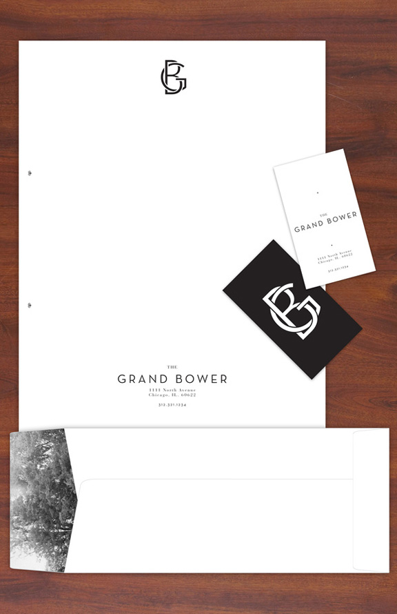 Connor McShane thought about the added touch of an envelope lining for The Grand Bower restaurant that adds a poetic touch of nature to an otherwise stark and minimalist letterhead.
Puzzle Piece 4: The body of the letter
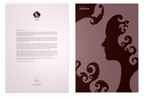 Erwin Bindeman shows what this letterhead for Lilybloom looks like with a letter on it. Always, always, always test your letterhead in the real world. Take a real letter that you've written and flow it into the body of your design. Then you'll see if elements need to be moved, scaled up or down, or eliminated altogether to make for a clear, easy-to-read letter. This also allows you to decide what's the best way to format your letters. If you want to use the same font as the logo and contact information to keep a cohesive look.
 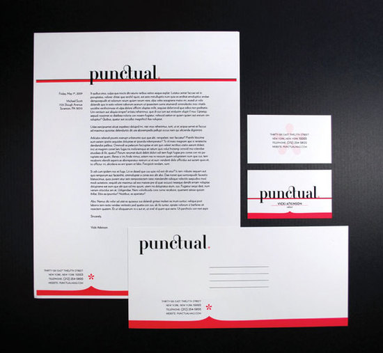 Designed by Steven Acres for Punctual Magazine, you can see that the body of the letter is meant to left-align to the descender of the P at the top of the letter and the asterix notch at the bottom. Lining the letter up with carefully place elements looks neat and organized without really trying.


[...] previous posts, Letterhead Possibilities: Part 1 and Part 2, we took a look at some considerations for how you want to brand yourself. (It’s not called [...]