

Part of good design is understanding color and what it conveys on a subliminal level. To have a successful logo, letterhead, storefront, etc., hinges on the obvious and not-so obvious cues you give off on a superficial level. People instinctively respond to certain colors, shapes and words at a gut level and good design capitalizes on that reaction. Color is one of the most visceral and instantaneous ways you can make an emotional impact on a viewer, and primary colors are the most elemental in the color spectrum. From blue, red and yellow: There is no ambiguity in the primary colors. They are as different from each other as they can possibly be. Let's focus on what the use of blue says about you. Blue’s meaning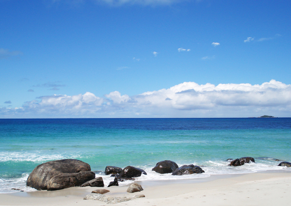 In nature, blue is associated with sky and sea. Both are vast and cool and mysterious. Both impart a sense of depth and calm. In terms of how the eye views blue, it is a color that recedes. This means that when colors are bluish they tend to seem more distant from the viewer than colors that have a red or yellow color cast. A technique often used in landscape painting called “atmospheric perspective” takes advantage of this visual trick. The artist makes the rolling hills and mountains in the distance of a painting more blue to give the painting more depth and make those elements seem further away.
 Blue is also considered a masculine color. It conveys stability, trustworthiness and intellect. It’s used often by corporate America in logos to signal these very attributes.
  According to Fortune 500 these are the top 10 most valuable corporate logo properties of 2010: 80 percent of them use the color blue in their logo. The disadvantages of blue are the other side of the coin of its strengths. Since blue is cool and recessive it can seem cold and unemotional to the point of being conservative, boring or depressing. It’s also a color not used very much in food packaging since it lacks the appetite appeal of warm colors. Not very many edible foods in the natural world are blue in color. Blue in analogous palette Using blue with the colors next to it on the color wheel (greens or purples) magnifies blue’s cooling power since they are often found together in nature. Blues and greens together evoke watery environments such as streams, lakes and oceans. While blues and purples together convey icy environments such as snow-capped mountains. They make for a soothing palette since they blend smoothly together making easy transitions for the eye
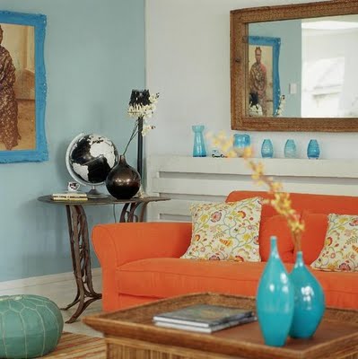
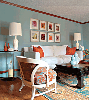
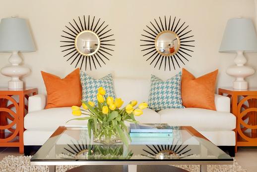
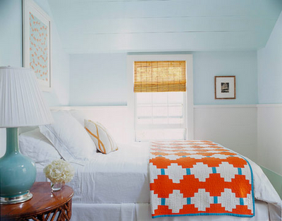
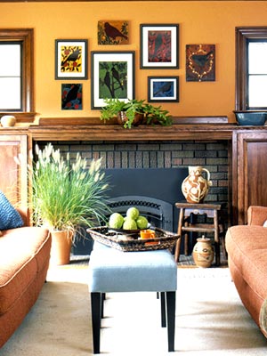
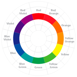
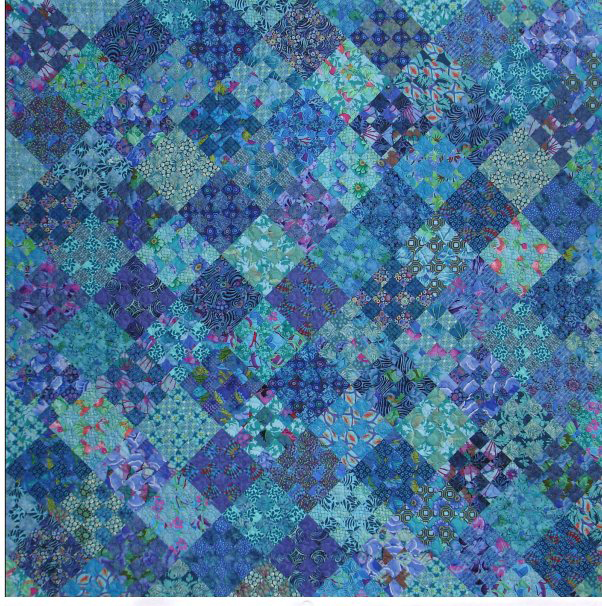 Blue in complimentary palette Blue’s compliment is the color on the opposite end of the color wheel from it — in this case, orange. When a color is combined with its opposite it creates a tension and vibrancy. Depending on the proportion of one to the other, these combinations can look juvenile and quirky or rich and saturated. The following images from Harvest Furniture show a range of rooms decorated in different proportions of orange to blue. Each one has a different feel and they pop to a different degree depending on the balance of colors.
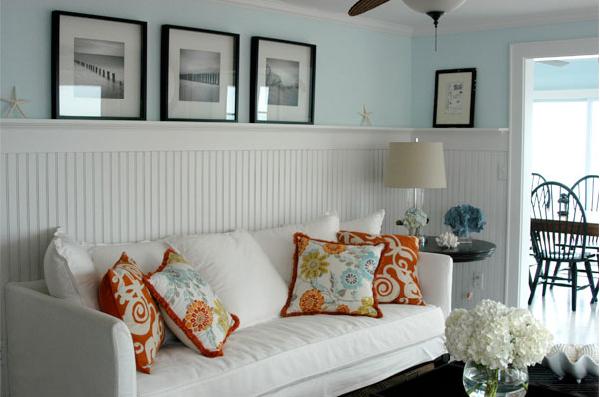
This lovely picture of the Australian coast from gotentrunks.com
You can see atmospheric perspective at work in this photo from traveljournals.net
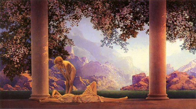
Artist Maxfield Parrish also used this technique to lovely effect in many of his paintings making foreground elements warmly yellow and background elements purple and blue.
This quilt pattern titled “Rainy Monday” from Amy Walsh of Blue Underground Studios uses an analogous palette of blues, blue-greens and blue-purples.


[...] already took a look at blue. Today, let’s focus on what the use of red says about [...]
[...] is an amazing color. As a highly emotional color, it can convey so much to the viewer with no real effort at all. The bright blue of a clear sky can cheer us, and the [...]