
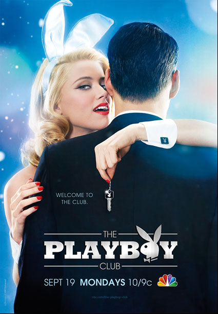
 Entertainment Weekly had a great slideshow on fall TV show posters (from which I found most of these images). I clicked through to see if there was anything inspired going on. The purpose of these promos seems to be mostly just to show you the faces of the stars, give the title of the show and tell you when it airs. Occasionally, there was also a tagline to give a sense of what the show was about. Some promos did this in a clever way, and some went above and beyond to letting the photography tell the story. I pulled out my favorites. Let’s take a look. The Good Wife
 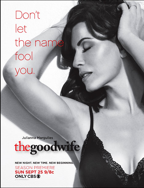 I like this approach. It's black, white and red, and they're confident enough with the concept that they don't insist on showing you a really obvious shot that it's Julianna Margulies. They play off of the title of the show in a smart way, letting it act as the answer to the question, "What does that headline mean?" An elegant solution. The Office
 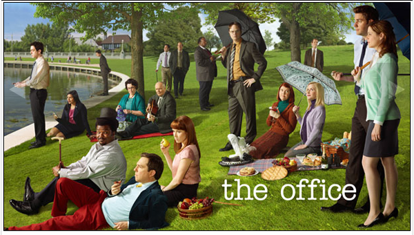 This is just nice in terms of imagery. It has very little to do with the actual plot of the show, but I'm a sucker for art references. And this nice evocation of Seurat's "A Sunday Afternoon on the Island of La Grande Jatte" (below) lets all the many characters interact in the landscape.
 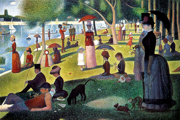 Prime Suspect
  The grayed-down color palette gives this a nice gritty feel. The dark space she's in also leaves a logical space in which to run a big white headline. The type is nice and bold, and the letters touching makes it feel tense. Also the terse, tiny tagline above it is well done. Revenge
 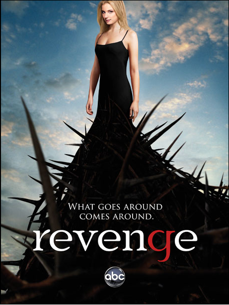 I'm not supercrazy about the type on this one. I'm not really sure why the "g" in "revenge" would be red, and the poster doesn't take pains to clarify. But the image has a great concept. Here's a young, beautiful girl who may be looking at you suspiciously or may be giving you a "come hither" look — it's ambiguous. And her internal mission to seek revenge has grown and grown like a tangled thorny bush until it has simultaneously engulfed her, raised her up and created a barrier of defense. Maybe I'm reading too much into it, but the nice thing about the image is that it allows me to take all that away even before I get the the tagline — which seems cliché and unconnected to the image. Person of Interest
  The image here uses an element of the title — in this case, a viewfinder of some kind — and frames the stars of the show with it. It also manages to place us in the context of New York in a subtle way. I don't really think we needed the fake lens flare, but it's a nice composition overall. Dexter
 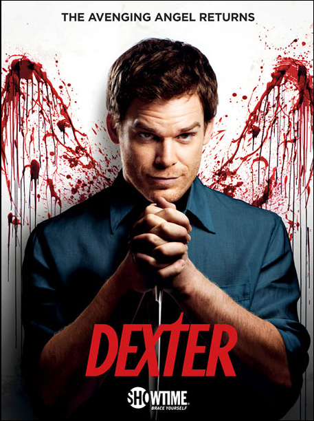 Gruesome but clever. The tagline at the top ("the avenging angel returns") sets up the visual concept. Dexter has blood-spatter wings, and in his praying hands he grasps a knife. Simple, iconic and shocking. Grimm
 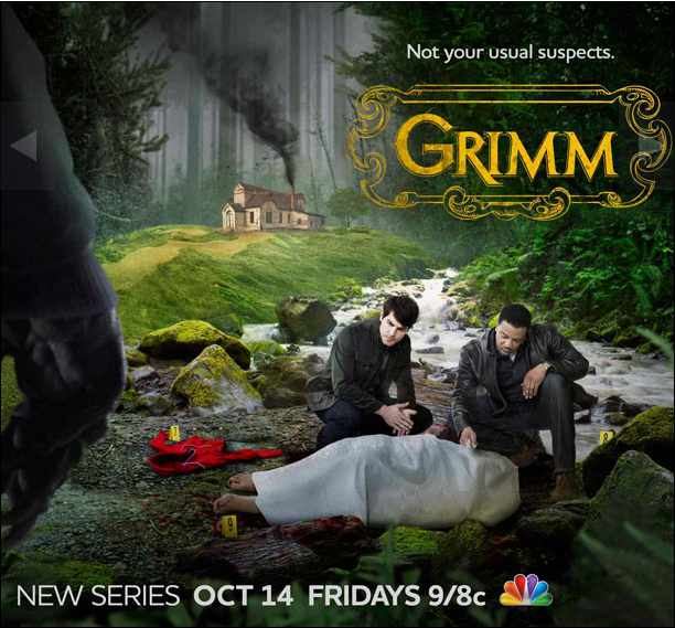 Now, I don't know if this series is going to fly. It takes the storybook world of Grimm's fairy tales and turns it into a setting for a police procedural. Maybe it will work, and maybe it won't, but it makes for a nice mashup of imagery. We have the backdrop of grandma's house, which is illustrated; the middle ground, where we bump up against a typical crime scene where Little Red Riding Hood(ie) met her end; and in the foreground we have the hand of the perp — the big bad wolf. The gilded, curlicued logo is a nice juxtaposition with all of this as well. It's Always Sunny in Philadelphia
 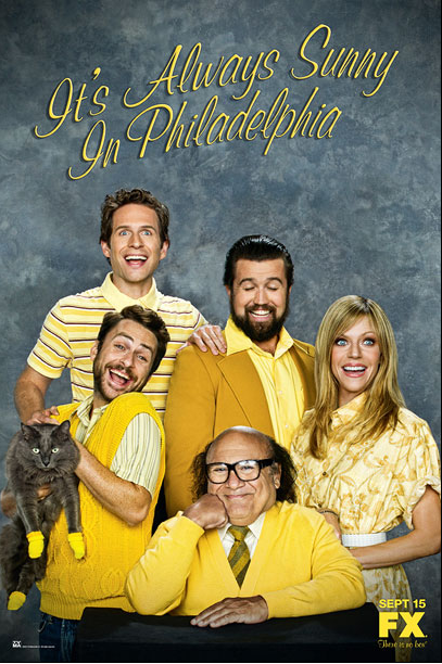 "It's Always Sunny in Philadelphia" takes a cue from the site Awkward Family Photos (see a real-life example below) and poses the gang in the most unnatural studio setting ever. We have the requisite closed eyes, matching clothes and fake smiles. Extra bonus points for including the kitten mittens.
 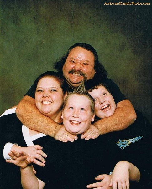 The Walking Dead
 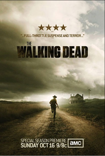 The first poster for "The Walking Dead" (below) was stunning, so it makes sense to follow it up by keeping all the things that made the first one great. A creepily desolate landscape? Check. A sense that something terrible is about to happen? Check. A lone man whose survival seems precarious? Check. The dark creeping clouds with that ethereal glow are really beautiful and frightening at the same time. This poster gives me almost as much anxiety as the show did last season.
 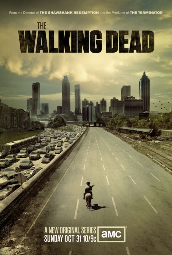 Up All Night
 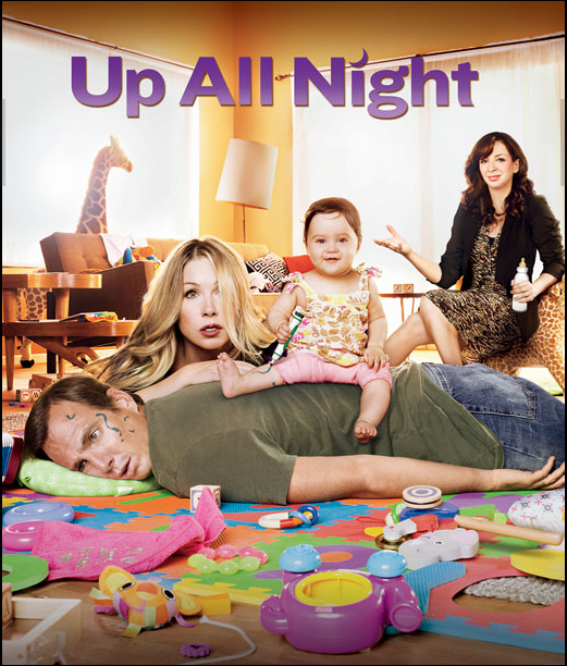 Besides the fact that they're working really hard to wedge Maya Rudolph in there, I like how natural the setting is in this ad. Especially compared with how contrived the image is for "Raising Hope" (below, which is a show I like, by the way), the poster for "Up All Night" looks much more like a real place in a real house with a very real number of toys all over the floor.
 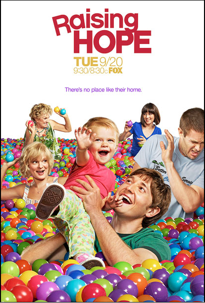 House
House 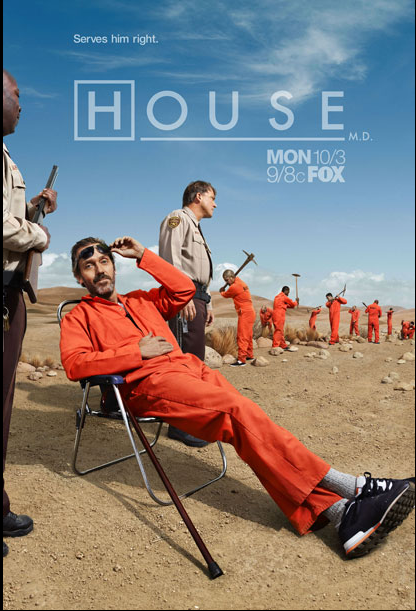 House looks like the arrogant bastard we all know and love(?) in a very "Cool Hand Luke" moment. I love the composition of the photo. The line of guards and inmates leads your eye into the depth of the photo, but the angle of House in the beach chair leads the eye back to the headline, which is nicely semi-transparent so that it integrates more with the clouds in the sky. This poster has lots of personality; we get the sense that this is the jail-time season. And the blue and orange (which are complimentary colors) make the image feel lively. American Horror Story
 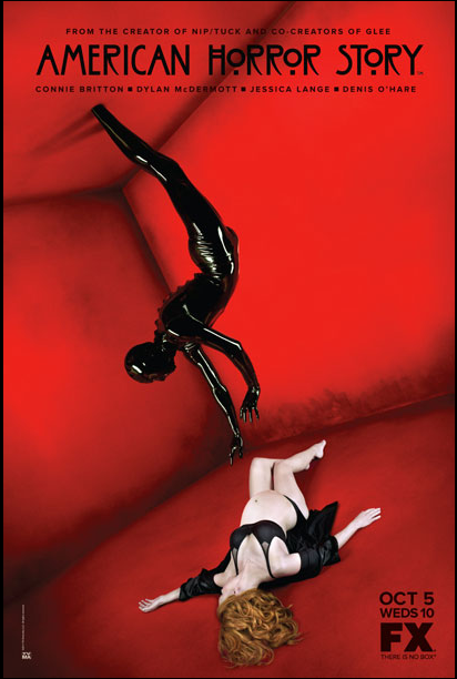 The promos for this show had such a weird, creepy vibe, and putting it in this abstract red room really gives it an identity. We have no idea what's going on or what it means, but we know it's unnatural, kinky and dangerous. This is another poster that sticks with a limited color palette, which makes it stand out. The Charles Rennie MacKintosh-esque type is a nice gothic touch as well. Pan Am
 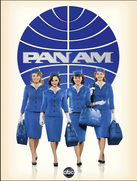 This is supericonic. This poster is a great example of letting the image do all the talking. The title of the show itself is a graphic grounding element for the cast. The girls stride forward confidently and sexily. We have the retro outfits, so we don't need a retro setting. It's almost like the logo for "The Man from U.N.C.L.E." (or maybe more like "The Girl from U.N.C.L.E., below).

The Best Fall TV Posters
October 5, 2011

About Rosana Mojica
Bookplate design: 3 tips for graphic designers Print marketing: 7 benefits to leverage in your business
Leave a Reply
What is the PsPrint Blog??
The PsPrint Blog is a resource for graphic designers, freelancers, small business owners and fans of print marketing. You'll find helpful techniques on printing everything there is to print, including business cards, postcards, brochures, stickers, invitations, greeting cards, door hangers, magnets and more. The PsPrint Blog shares creative ways to improve your design and layout skills, and useful tips for marketing your business in any medium. We also like to have a little fun, sharing design inspiration and spotlighting some our favorite customers' printed pieces in our "Hot Off the Press" series.


thank you. it is a very interesting article