

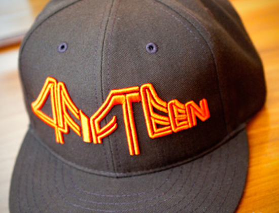
![]() Muni's iconic "worm" logo was designed by Walter Landor in the 1970s and is still with us today. It's a love-it-or-hate-it kind of logo, but it will never be mistaken for the municipal railway logo of any other city than San Francisco. For better of worse it's distinctive and memorable. That's probably why no one has tried to redesign it, even though it's obviously a product of its time and has not aged in a timeless looks-modern-even-though-it's-not way. I remember seeing the logo as a child. It took a long time before I realized it was spelling out a word, and I was so struck by it that I remember wondering how many other people had figured it out. If you grew up in San Francisco in the '70s it was just part of the identity of the city. It's been parodied, bashed and lovingly commemorated in equal measure. San Francisco apparel company 4fifteen, named for the city's 415 area code, even made a "Muni Driver" cap that uses a "worm" version of its logo and only comes in the classic Muni uniform color combination of brown and orange.
Muni's iconic "worm" logo was designed by Walter Landor in the 1970s and is still with us today. It's a love-it-or-hate-it kind of logo, but it will never be mistaken for the municipal railway logo of any other city than San Francisco. For better of worse it's distinctive and memorable. That's probably why no one has tried to redesign it, even though it's obviously a product of its time and has not aged in a timeless looks-modern-even-though-it's-not way. I remember seeing the logo as a child. It took a long time before I realized it was spelling out a word, and I was so struck by it that I remember wondering how many other people had figured it out. If you grew up in San Francisco in the '70s it was just part of the identity of the city. It's been parodied, bashed and lovingly commemorated in equal measure. San Francisco apparel company 4fifteen, named for the city's 415 area code, even made a "Muni Driver" cap that uses a "worm" version of its logo and only comes in the classic Muni uniform color combination of brown and orange.
Well, thanks to Metrobits.org, which compiled transit and subway system logos from around the world, I can finally compare Muni to other logos and pick out some of my favorite domestic and international transit logos. Best American transit logos Most transit logos (even the international ones) use an "M" as the mainstay of their logos, so it's hard to find logos that don't look generic. Here are some of the more distinctive American logos. 


 From top to bottom: Massachusetts Bay Transportation Authority, Chicago Transit Authority, New York Municipal Transit Authority and Southeastern Pennsylvania Transportation Authority. Each is successful mostly because of its simplicity and clarity. SEPTA and New York make use of diagonal emphasis to give a sense of movement, which is another plus.
  As a bonus, the logo for the new Las Vegas Monorail is also quite nice. It's more abstract, but we still get a sense of sequence and motion. Best abstract concepts Like the Las Vegas logo, some transit logos take a conceptual approach and don't include any acronyms or letters to explain themselves.


 From top to bottom: Athens, Barcelona, Incheon, Nagoya, Sevilla, The Hague and Yokahama. Most of these logos get their abstraction from suggesting forward motion or moving to and fro. Some abstract the path or tracks, with Yokahama getting especially nice synergy between the intersecting tracks and the letter "Y." Most interesting variations on the letter "M" Since the underground is referred to as the metro in most languages, the "M" is a common theme. These are the logos that really explore the graphic possibilities of the letter "M."


 From top to bottom: Amsterdam, Brasilia, Fortaleza, Malaga, Manchester, Maracaibo, Marseille, Minsk, Recife, and Yekaterinburg. A few of these make the "M" a dimensional object looping in on itself or take the idea of tracks and separate out the "M" into segments separated by a thin white line "track." It's a great creative approach to take the letterform and tie it to a concept like motion or make it evoke a physical object like a set of tracks converging. As far as I'm concerned, Muni still comes out on top.


[...] on the PS Print blog, Rosie muses about growing up in the 415, loving the Muni worm logo, and eventually learning that [...]
Manchester's tilty grey gradient design used on the trams is being binned - but we will still have a new version of the "M-blem": another design originally from the seventies, very similar to Muni with the stripe down the middle of the letters.
Funny. Logos are like fashion. If you wait around long enough the style that looked dated is now in vogue. That M-blem does indeed look like a Muni cousin, James.
lovelove youoyouyouyou momomomomomomomomom so you are mymymymymy favret