

Here we go with another batch of movies to add to the growing list of 2012 blockbusters! Along with those movies come the sweet, and not so sweet, poster designs giving us our first glimpses of the film via the print medium. Let’s see how the poster designs match up with these 12 upcoming films sure to make a buck at the box office. 1. The Avengers
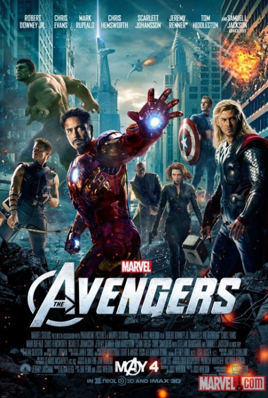
I wanted to start with this one first, because in my prior blog post about movie posters I gave the teaser poster for “The Avengers” a dismal D-. Granted it was a teaser, but it was pretty sloppy. The official movie poster has since graced the web with its presence and redeemed the poster design cred for this flick. I think my favorite thing about this poster is that Samuel Jackson as Nick Fury takes a backseat, which is appropriate. I don’t have anything against Samuel Jackson, but “The Avengers” I grew up with had no Nick Fury. His addition mainly comes from the re-imagining of the Marvel World in the 2000s. Either way, I understand his place in the movie as the recruiter, but his looming figure in the teaser poster was awkward. There’s just something about Sammy J staring at you down with one eye, arms crossed, that makes me uncomfortable. This poster is way more striking – Iron Man is about to blast something, Hawkeye is showing off his arms, and Thor is giving some villains a stare down – just how an “Avengers” poster should be. Grade: A 2. Battleship
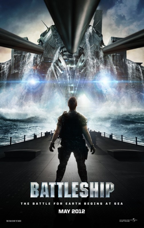
There seems to be a whole slew of teaser-like posters coming out for “Battleship.” There are also some non-English, more official looking posters, since the movie was released in most of Asia and Europe already. It will hit theaters in the U.S. on May 18, so perhaps the full poster is yet to come. Nevertheless, I have to say the teasers look pretty cool. With an abundance of really cool graphics I can imagine the poster concepts weren’t that hard to come up with, but this composition is well done and the camera angle is quite clever. Overall, this teaser poster sets an appropriate mood for the movie – showing battleship guns dwarfed by some mega-alien water ship. I have my doubts about the movie itself. It just seems like an “Independence Day” meets “Transformers” with Rihanna thrown in. Transformers had that nostalgic appeal that made the cheesy dialogue bearable, but “Battleship” has no excuse. I do expect the sound and special effects to be top notch, but I doubt I’d be able to sit through this one. Grade: B- 3. Snow White and the Huntsman
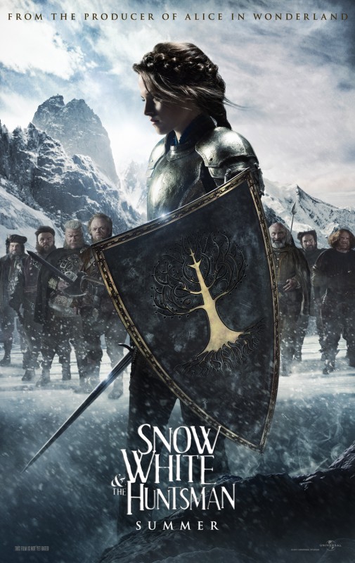
If the evil and vain Queen Ravenna is as scary as the Queen was in the “Alice in Wonderland” remake from the same producer, then this movie will be a bit of a joke in my eyes. However, I did find this snap shot that looked slightly creepy. As far as the poster goes, I’m not really digging the overly Photoshopped image of actress Kristen Stewart as Snow White – she also looks quite awkward in battle garb. I imagine wearing armor and holding a huge shield requires quite a bit of muscle, but not in Hollywood apparently. The dwarves in the background look something like “Lord of the Rings” rejects with really awful haircuts. Maybe I’m missing something, but I also don’t understand why the rock at the bottom is steaming, and why there is only snow below her waist. Did she just slay some mighty rock-like creature that fell and caused all the snow to kick up? Who knows – the tree design on the shield is pretty neat though! Grade: D+ 4. Prometheus
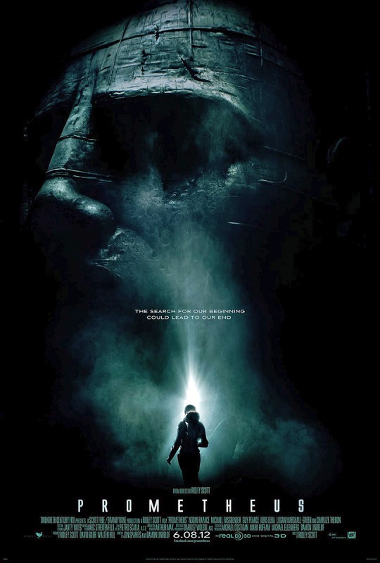
Now that’s a cool poster: A huge stone-carved face being discovered in a very dark place. What does it mean!? I like the central glow of the explorer’s light and the well-placed small type right above the flashlight. It directs the eye well. Did I mention this movie is also directed by Ridley Scott? This is the same man who directed “Alien” and “Blade Runner,” two of my all-time favorite sci-fi movies. He also has quite a few other critically acclaimed films under his belt such as “Gladiator,” “Thelma & Louise” and “Hannibal,” to name a few. The minimal bold type of the movie title used on the poster is well done and reminds me of “Alien.” According to Ridley Scott, the film “Prometheus” takes place in the same universe as “Alien.” The premise of the film will revolve around the discovery of an extraterrestrial culture, but will not relate specifically to “Alien.” I don’t doubt that this one will be epic. Grade: A 5. The Expendables 2
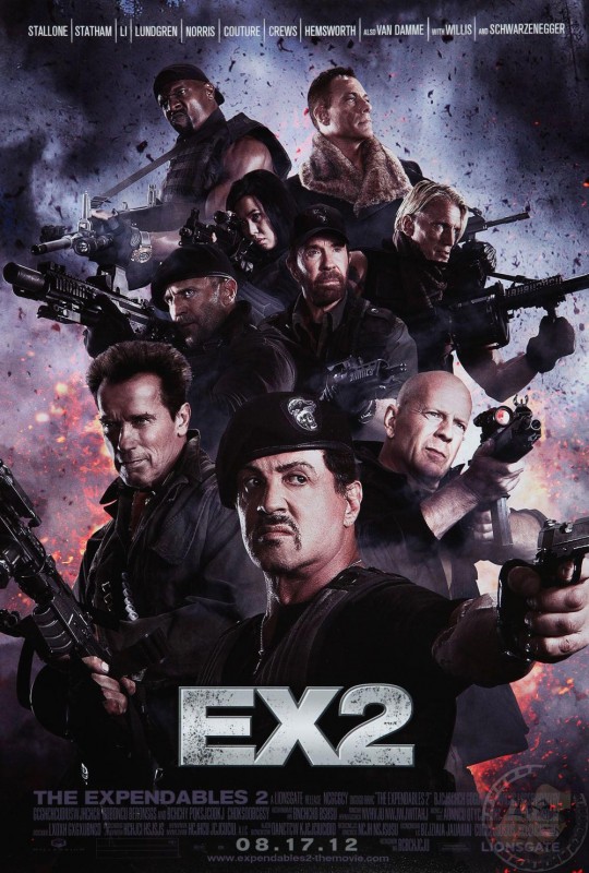
I only watched the first half of “The Expendables” before turning it off. “The Expendables 2” doesn’t look like it will be any more exciting. Norris and Van Damme – really? I suppose that’s what Sylvester Stallone’s creation is all about – rehashing expired action stars. I like good action flicks, but this formula is just tired and poster speaks for itself. I suppose the creator of the poster probably did the best they could with the material given to them – following the generic theatrical action poster blueprint of showcasing the cast in a collage of gun-wielding stars. Needless to say, it’s not much to look at and reminds me of the Avengers teaser poster – it just looks like someone assembled a group of cardboard cut outs in front of a big explosion back drop. And lastly, what’s up with the look on Schwarzenegger’s face? Grade: C- 6. G.I. Joe Retaliation
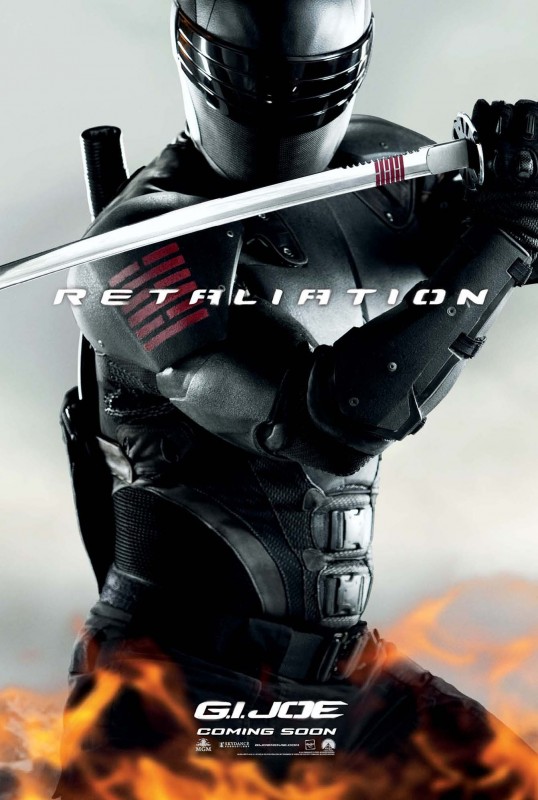
Even though it’s simple and not exactly a design masterpiece, I like this one. The composition is well done for a teaser and not over the top; focusing on the intricate battle gear of the character and adding in some well-placed type and — of course — fire for good measure. The font used for the title “Retaliation” is pretty sweet, too. The plain background gives focus to the military ninja costume worn by Snake Eyes, the coolest of all “G.I. Joe” characters. I won’t expect much from the actual film since it is after all based on a children’s cartoon, but it could be fun. The whole poster series showing each character can be found here. Grade: B- 7. Looper
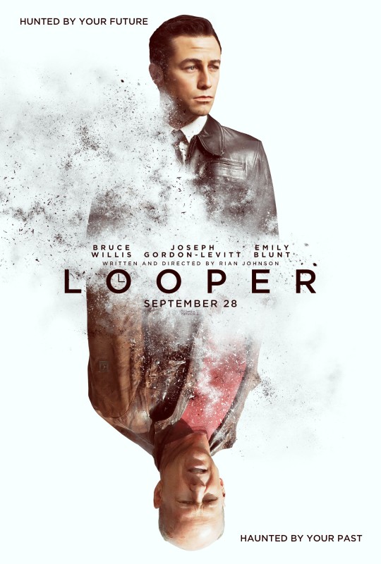
This totally reminds me of the “Total Recall” movie poster, but the concept is slightly different for “Looper.” Instead of being about memories like “Total Recall,” Looper focuses on time travel. Joe, played Joseph Gordon-Levitt, is a hired “Looper” who works for a mob in Kansas City in the year 2042. His job is to kill people on schedule as soon as they arrive from the future, sent back in time by a Beijing crime group in the year 2072. When one target arrives he recognizes the victim as himself and hesitates, allowing his older self to escape and therefore making himself a target. The plot is similar to other crime dramas, where the hunter becomes the hunted, but overall the production quality is looking pretty top notch! I like the mirrored effect of the poster and use of particles blowing away in the wind to illustrate fluidity of time. The all-capital letter movie title with the clock inside the “O” is a clever use of customized typography and despite being basic it fits really well with the overall feel of the poster. A great poster for what looks to be a promising film! Grade: B+ 8. God Bless America
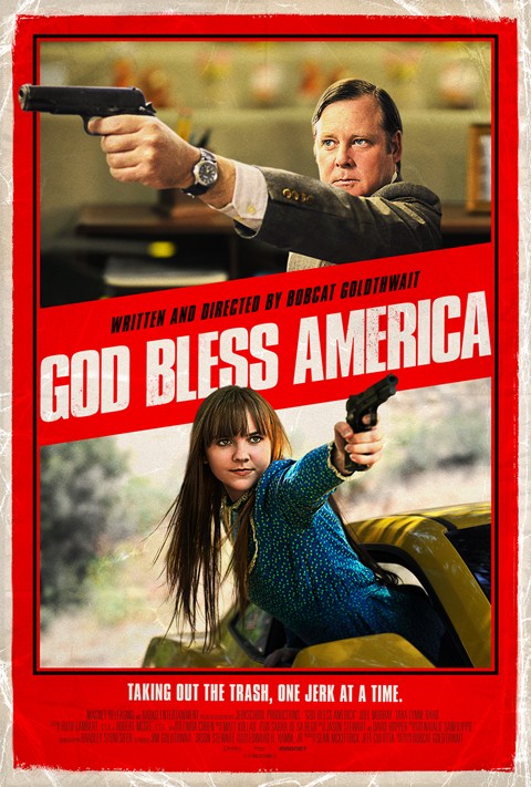
I love the weathered look on this poster and something about it has a Quentin Tarantino feel, probably just because the creases and the textured spattered type give it a “Grindhouse” flavor. The designer also cleverly places certain portions of the photograph in front of the red frame, which gives the illusion that the guns are popping out of the poster. The movie itself combines political satire with dark comedy and in some disgusting way sounds like it could be a good watch. The plot focuses on Frank, who after being diagnosed with a brain tumor is about to commit suicide when he sees a reality TV show in which a spoiled teenager throws a tantrum over receiving the "wrong car" for a birthday present. Instead of killing himself, he then decides to take out his frustration on the cruelest, stupidest and most intolerant people he can imagine – starting with some particularly nasty reality TV stars. Of course, we can’t just go around offing detestable people, but we can at least watch it with a bit of social commentary! Grade: A- 9. Iron Sky
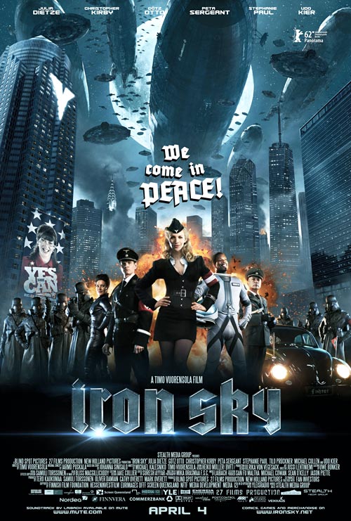
This German-Australian-Finnish piece may not exactly be an upcoming film, since the United States release date is still to be determined. However, I still thought it was pertinent (don’t pay attention to the April 4th release date). The typeface used here is ace! It has kind of an Old English meets communist feel, and the designer did a great job with the gleaming metal texture. I like the overall feel of the poster and the details really give us a glimpse of the movie’s story – blimps, space ships, a burning city, politicians, Nazis, astronauts. It sounds like it might be a bit campy, but it could be a good time! Grade: B 10. Cosmopolis
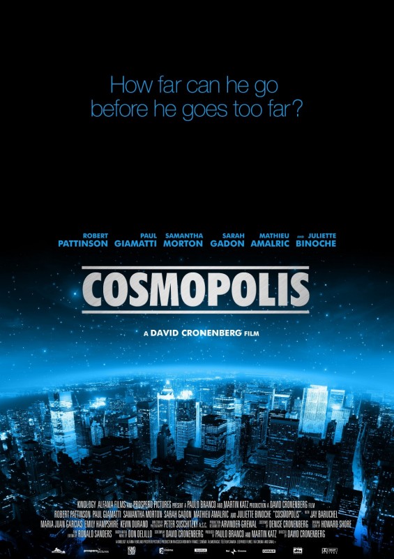
The movie itself sounds pretty riveting, but this poster is a bit of a snooze. Then again it’s just a teaser, but I think they could have at least chosen a more interesting font for the question at the top – “How far can he go before he goes too far?” Also, why do the stars just disappear completely towards the top of the poster? I do like the blue cast put over New York City, because it gives a slightly sci-fi surreal feel. The movie title is well done, and I like the typesetting of the actor and director’s names – it makes me wonder what went wrong with the top half of the poster. Overall, just by reading the movie’s synopsis it sounds like it could be one of top films of the year, so the mediocre poster is excused. Grade: B- 11. Piranha 3DD
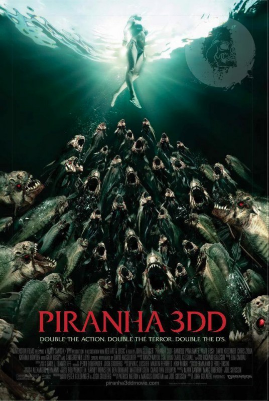
What can I say about this one? I think I am a little taken aback by the catch phrase “Double the action. Double the terror. Double the D’s.” Say what? But, I suppose it fits. The illustration of the killer fish squad is actually pretty creepy. “Piranha 3DD” is a sequel to “Piranha 3D” and takes place in a water park this time around, instead of a lake. I also was surprised to find out that “Piranha 3D” was somewhat well-received by critics for its balance of satire, camp and horror along with 3-D special effects. The type used for the movie title is quite well done and the poster overall maintains a nostalgic feel, similar to “Jaws.” All in all, it’s a decent poster for an intentionally campy horror film! Grade: B 12. Madagascar 3
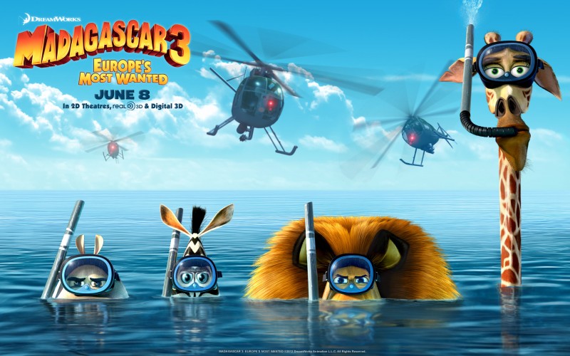
Perhaps the “Madagascar” series should be put to rest, but hey, my nephew and niece love it as I’m sure many other kids do. Dreamworks knows it, too, so why not continue with making number three? “Toy Story” did it! The original “Madagascar” had some good laughs, and this poster does make me chuckle due to the clever and simple joke of the Giraffe not being able to properly use his snorkel. The movie title, production credit and release date are well placed, too. Nothing too fancy here! Grade: B- About the Author:
 | Paul Smith is the newest addition to PsPrint’s blogging team, filling a new role as content writer after establishing his roots with PsPrint’s Customer Service department. Although new to blogging, Paul is no stranger to writing, having had a crush on words and books for as long as he can remember. With a love for the environment, food and music, Paul can be found after work cooking up a storm of healthy mouth-watering vegan food (yes, it’s possible!), reading an epic sci-fi novel or expanding his quirky eclectic music collection whilst watching a nature documentary! Email him today at paul@psprint.com or follow him on Twitter. |


The only problem I have with the Avengers poster, is the fact that throughout Ironman 2 and the trailers for the movie, Ironman has the triangle chest piece. However, in this poster he wears the old round chest piece. I haven't seen the movie yet to know whether he goes back to the old suit design, but that was the one thing that really stood out to me with their poster.
I think we should do an office field trip to see "Prometheus."
Sonia, I totally agree!! Ridley Scott is a genius.
I do not like the way Bruce Willis looks upside down!
[...] done two posts dedicated to posters for upcoming movies, I decided it was time to revisit some classics. Surprised at my own excitement [...]
@jeff w, the difference between the old iron man suit chest piece and the new one, is that if you were getting laid, you wouldn't care. worst. poster.ever.
[...] silver screen, and a deluge of amazing fan art is right on their heels. You know you have a great movie – or at least a hugely popular enterprise – when hundreds of fans toil away at designing [...]
I really don't like the Avengers poster much. Especially after seeing the movie. Captain America should have been at the front. I mean, he is the leader after all. Why is Tony Stark not wearing his helmet, other than the fact that Robert Downy's ego would take a massive hit? Also, you can't tell what they are really looking at. They don't seem to be aware of each other. If Hollywood is trying to sell us a movie about a super team, it would make since if they gave us a little more of a team feel in the Official Poster. Good list though, I really enjoyed it. Thank You!
lol@Omar@ Robert Downy's ego! Interesting concept on the "team" design; I wonder what the alternative would have looked like if your suggestion was incorporated.