

Having done two posts dedicated to posters for upcoming movies, I decided it was time to revisit some classics. Surprised at my own excitement over the "Prometheus" poster, it seemed only natural to pick science fiction as the genre focus for my post. Science fiction has been good to us over the years, and the posters have not disappointed! Here are my top 10 picks for the best sci-fi movie posters of the past few decades. 10. Robocop (1987)
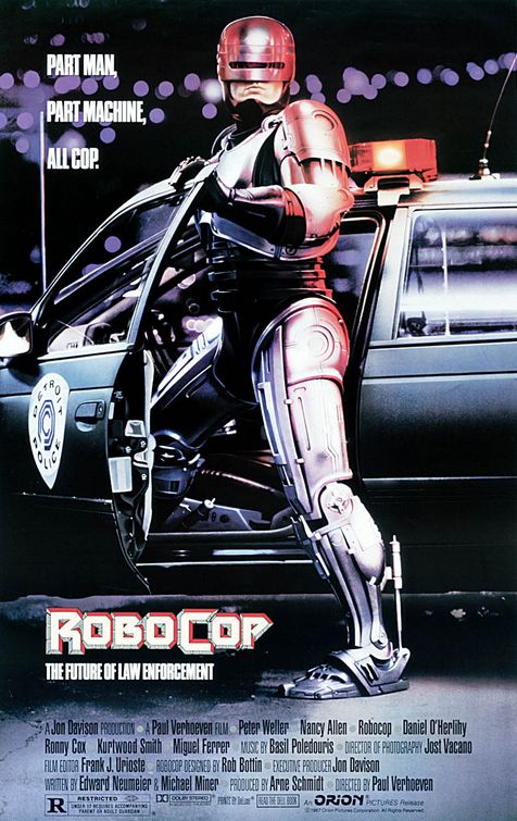
Pretty sweet poster, but I can’t help but wonder how Robocop fit into that Ford Taurus. It must’ve been a tight squeeze with all that robo-armor. Seeing this poster makes me want a RoboCop suit of my own; however, that might make for one hell of a responsibility. It wouldn’t exactly be all rescuing puppies from burning buildings and carrying groceries for old ladies. There must be a reason why RoboCop never smiles. Anyway, the RoboCop poster takes the No. 10 spot for its cool lighting effects and gritty 1980’s look. 9. Westworld (1973)
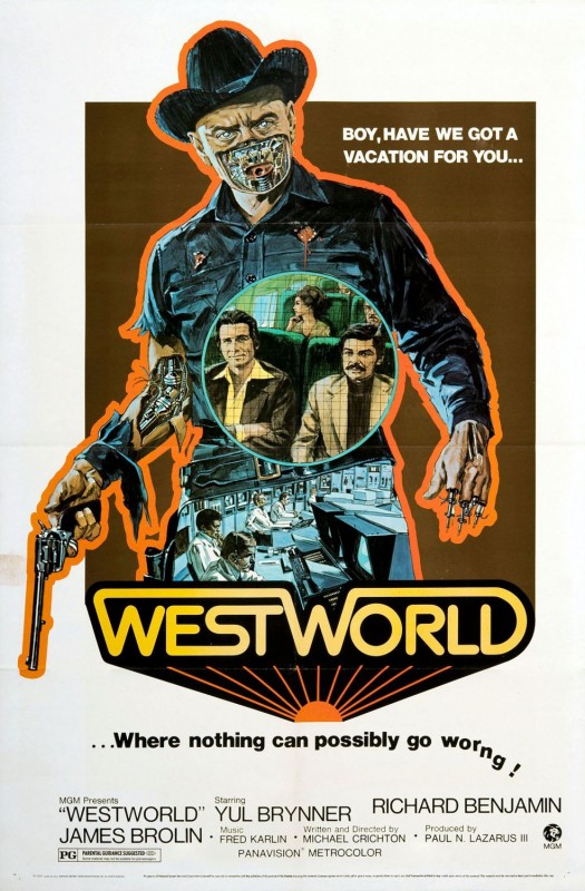
Considering this was made in 1973, it is a pretty incredible poster. The hand-drawn image of the android has some great details, including the chopped fingers and exposed circuitry on the left arm. The “Westworld” type looks quite ahead of its time with the gradients, connected lettering and rising sun right below it. I actually haven’t seen this film, but upon reading the plot I think I may need to take a trip back in time and check it out. The whole premise is based on a vacation theme park where you interact with androids in one of three worlds – old American West, ancient Rome or medieval Europe. One day the androids have a system failure and turn on the humans – surprise! The resort’s supervisor try to turn the power off, but the robots continue to run on reserved power and hunt down the trapped vacationers. 8. Stargate (1994)
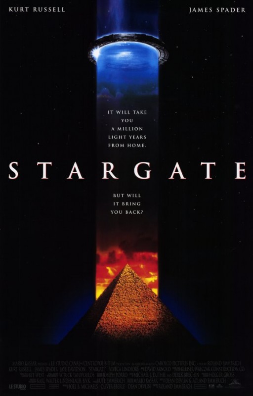
So the film may not have been one of the most critically acclaimed of all time, but it was a pretty solid sci-fi flick in its day. There may have been corny parts, but they contributed to the B-movie charm. The Egyptian head masks were creepy and neat! The pyramid and circular gate design shown on the poster are an iconic symbol in my mind. To me they represent my own youth and fascination with sci-fi. Nevertheless, I think the design is well done and suits the character of the movie well. 7. Clockwork Orange (1971)
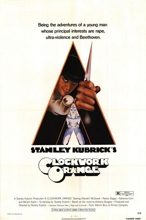
Oh the ’70s – I only wish poster designs these days showed the same creativity as back in the day. The typeface used for Stanley Kubrick’s name and the movie title is amazing. Hooray for custom typefaces! I also really like the overlapping letters and 3-D effect applied to the movie title. I’m only just realizing that the center piece of the design is an “A” making it “A Clockwork Orange”, or is it? Timeless design for an epic film! 6. Total Recall (1990)
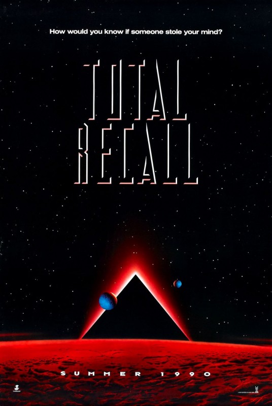
So much old-school sci-fi goodness here! This was only the teaser poster; but, it is way cooler than the theatrical poster that has Arnold’s mug as the centerpiece. It may be slightly cheesy, but the white 3-D effect around the movie title’s black type combined with the red glow is sweet! This poster would have been right on the cusp of the advent of 3-D computer graphics so I have to give it credit. The year this film came to theaters was also the same year Adobe PhotoShop 1.0 was released. Even the new poster for the “Total Recall” remake can’t really touch this classic design. I wish I had an original print! 5. Mad Max (1979)
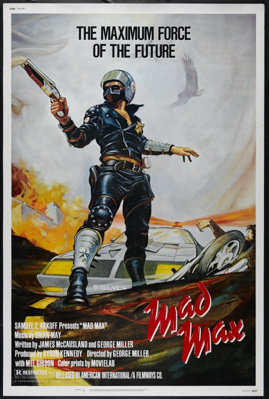
Talk about iconic – this poster is a fixture in sci-fi history along with the movie itself. There’s no denying “Mad Max” is a cult classic. This poster does the film justice with the classic hand-drawn look – nothing too overtop being that the film’s budget was only $380,000. I love the subtle details like the smoke pouring out of the gun, the hawk and the eerie limp hand. 4. Star Trek 2: Wrath of Khan (1982)
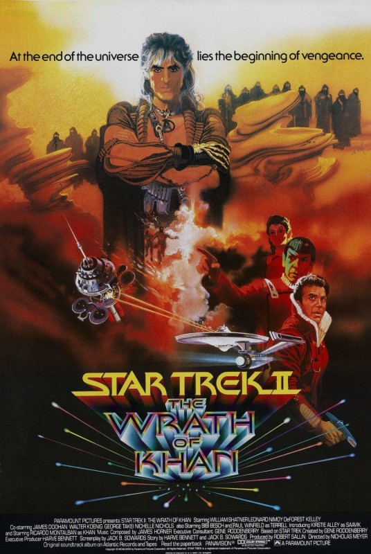
I love this one for the tie-dye “The Wrath of Khan” type that looks like it just arrived from warp speed. Something about the rainbow effect doesn’t really make Khan’s wrath sound so daunting though. Overall the composition of the poster is well done with the way the background blends into different scenes and the manner in which each element is placed. I love how the bottom says “Original soundtrack album on Atlantic Records and Tapes” – soundtrack on vinyl you say?! 3. Tron (1982)
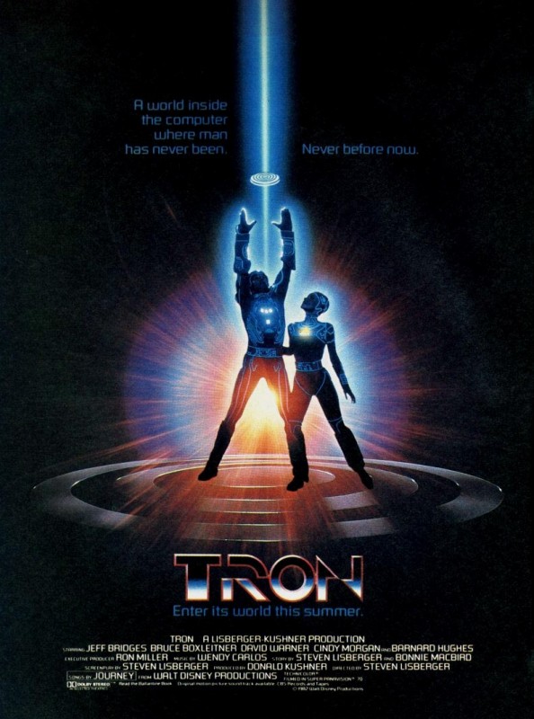
1982 must have been a good year for posters, “Star Trek 2: Wrath of Khan” and then “Tron”. There isn’t much to say about this poster except that it is epic. I think the “Tron” font is my favorite typeface of all time. Interestingly enough, the film was only mildly successful upon initial release but became a cult favorite over time. Producers first pitched the script to MGM, Columbia and Warner Bros, but were turned down. Disney ended up cautiously agreeing to fund the movie in 1982 and I bet they sure are glad they did after “Tron: Legacy” raked in almost 400 million in box office sales in 2010. 2. Star Wars: The Empire Strikes Back (1980)
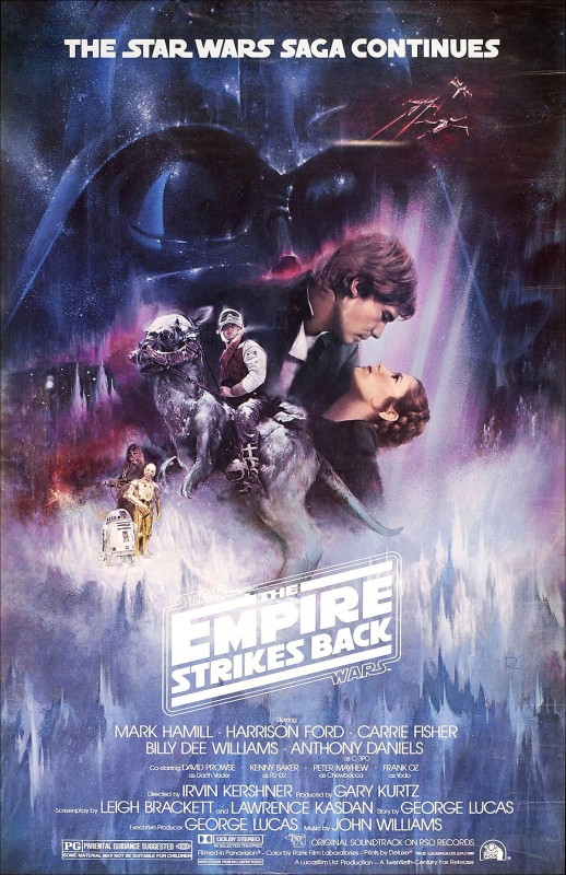
We knew this one was coming somewhere. Of course I couldn’t just put all three up, that wouldn’t’ be fair, so I chose the best. Something about the poster for “The Empire Strikes Back” stood out artistically – the meshing of the backgrounds, textures and landscapes along with the well composed placement of the different characters. I also think the Taun-Taun is freaking neat, so this was a natural choice. Whoever did the movie title design did a great job as well; I love the way certain letters stretch and create lines. 1. Blade Runner (1982)
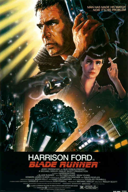
Hailed by many as the best sci-fi film of all time, the movie’s poster does not disappoint! I wonder what techniques were used to create it – certain parts must have been hand drawn. I’m just realizing this is another timeless sci-fi creation released in 1982, along with “Tron” and “Star Trek 2: The Wrath of Khan.” Something must have been in the air around that time. I love the comic book style of the drawn characters along with what looks like a rendered cityscape at the bottom. Overall the poster has a very moody feel, which suits the movie well. Last but not least, the custom typography used for the movie title is for some reason extremely memorable. All I have to do is think of the movie and the type immediately pops into my head, which is one of the main reason's why I chose this poster as number one. About the Author:
 | Paul Smith is the newest addition to PsPrint’s blogging team, filling a new role as content writer after establishing his roots with PsPrint’s Customer Service department. Although new to blogging, Paul is no stranger to writing, having had a crush on words and books for as long as he can remember. With a love for the environment, food and music, Paul can be found after work cooking up a storm of healthy mouth-watering vegan food (yes, it’s possible!), reading an epic sci-fi novel or expanding his quirky eclectic music collection whilst watching a nature documentary! Email him today at paul@psprint.com or follow him on Twitter. |


Great ones, but what about "Alien"? Talk about iconic, and its influence is very apparent in the aforementioned "Prometheus" poster...
As good a film as "Alien" is the poster seemed quite boring in comparison to these other posters. It's just a basic font with a glowing egg. It's certainly memorable and stands out in my brain, but there's not that not much design action going on with it. Perhaps its greatness lies in its simplicity?
The "Alien" poster is iconic. I think "ET" and "Brazil" could have been on this list, too.
[...] PSPrint on Top 10 Throwback Sci-Fi Posters. [...]
Awesome list Paul! I do agree that the "Alien" poster was memorable ... I think the typography is so iconic it could have even stood on its own. Blade Runner was a great pick!
[...] recent years have seen an influx of alien invasion movies not seen since the 1950s. A popular sci-fi topic for decades, let’s take a look at how 1950s and 1960s Martian movie poster designers [...]
[...] love great movie posters; we adorn the walls of our home theaters and man caves with them. Yet it is perhaps unfortunate [...]