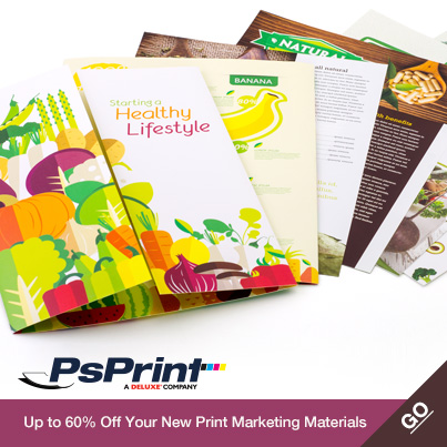
A printed brochure usually comes in to play as a take-away to leave with clients, after a formal face-to-face meeting, or it is a part of a direct-mail package, which may include a letter and other written materials. The job of the brochure is to reinforce the selling points of the product or service and to provide some visuals that the customer cannot get from a letter or a conversation.
Whether you're printing 50 brochures for a business meeting or thousands of brochures to include in a direct-mail campaign, here are a few simple tricks to creating brochures that sell. 1. Whitespace is your friend Some folks' eyes may glaze over during a phone call or sales pitches, and most people only scan e-mails and direct-mail letters before throwing them in the trash. That leaves the brochure as the last resort in many sales situations. Brochure design should be easy on the eyes and the layout should underscore any important copy or images. The selling points should literally jump off the pages of the brochure. Use enough whitespace to give the brochure's headlines and call to action an added oomph. A good amount of whitespace will also make the brochure look crisp and modern and not garish and sales-like. 2. Use headlines and subheadlines Good headlines can walk a reader all the way through a brochure providing clarity and transition between bits of copy and images. Think about the logic of the brochure and which copy should go first, second, third, etc. Then write headlines, and if necessary, subheadlines that not only summarize the paragraph below, but create a flow from one section to the next. In a successful brochure, if you read the headlines only, you would be able to grasp the selling points of the product. Headlines and subheadlines also work to break up the copy in a brochure, especially in larger formats with several folds, making the brochure more inviting to read than a formal letter. 3. Feature photos and illustrations As stated above, the brochure is most useful when it provides a visual component that may have been absent from the sales pitch. Make sure there is ample real estate in a brochure for photographs of the product or service. Providing captions underneath each photo will improve the chances that customers at least glance at the pictures. Aside from photos of or related to the product or service being sold, the brochure should also convey a sense of the company's unique brand through graphic design. Full-color brochures, rather than black and white, will produce the greatest effect. For some brochure design inspiration, check out these ideas.


[...] there can help spark your own creativity not only for packaging and labels, but also postcards, brochures, posters and more. I’ve hand-picked the following package designs to share with you, each with [...]