Hey guys - Tarah here, stepping in for our regular writer while Sonia is out! I am no match for her witty writing skills, which is why the blog has been on hold for a bit. However, we just couldn't wait to share the artwork winners from our recent Customer Art Contest! We had some amazing pieces submitted, and after more than 50 went through our judging panel, we finally selected our three favorite (believe me, it was no easy feat!). And without further adieu, here are the winners in no particular order: ![]() Samantha Myers, with Country Girls Espresso.
Samantha Myers, with Country Girls Espresso. 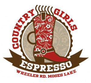 Here are a few words from Samantha about her piece: "The logo represents my espresso company through symbolism. The femninine cowgirl boot coffee cup, and the medallion with a banner which is reminiscent of first place at the county fair. Highlighting down home country girls with top quality products. Using PsPrints high quality clear stickers at a phenomenal price has allowed me to place my brand on every item I sell. People have commented that I have spent too much for custom printed cups, where in fact I have been able to achieve an expensive custom printing look at a fraction of the cost."
Laura Anderson, LA Creates, located in Oakland. 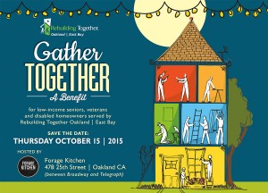
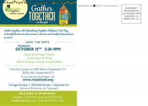 Here is a bit about Laura's piece in her words: "Rebuilding Together Oakland / East bay (RTO East Bay) is a local non-profit doing all kinds of good things for low-income seniors, veterans and disabled homeowners. I was excited to be asked to contribute my design and illustration skills in service of such a great community-focused organization (for more info, check out rtoakland.org.) The benefit theme, 'Gather Together’, symbolizes the unity and teamwork that results from community members coming together in service of a common cause. We wanted the identity design for these materials to reflect that same sense of unity and partnership, in addition to being fun and engaging. The illustrations were designed to be flexible—the elements within the house illustration can be used separately, or rearranged for a specific use. We've already started to take advantage of this flexibility in some of the web graphics we're creating and I'm planning on using some new arrangements for the additional collateral we'll be working on later this month."
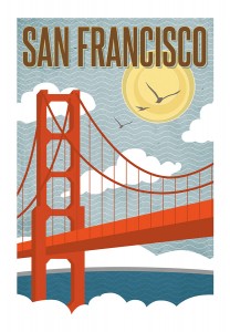 Renee Pulve, Designer and Artist with Smudge Design Co. Here are a few words about her piece: "This illustration was created as part of a vintage travel poster series focusing on popular U.S. destinations. Ms. Pulve's creative inspirations are fueled by a love for travel and animals."
All of Renee's products are proudly printed in the U.S.A. and designed in Southern California.
Sonia will be back and writing soon, I promise, so in the mean time, thank you for 25 years of supporting us in the Bay Area, and keep the amazing printed materials coming!
For more marketing tips and ideas, check out our How To Jumpstart Your Marketing guide.




No comments yet.