Want to create a cool self-promotion for you design business, but don't know where to start? Try creating an infographic poster. Posters are great free giveaway items that people will admire and hang on to. Plus showing off your abilities to take raw data and information and make it a visual delight will help you to get more business. You could make the poster about an issue you care about, a favorite pop culture reference, about the kind of work you do or about your personal life. Whichever content you choose, check out these 12 unique infographic posters below, for design inspiration.
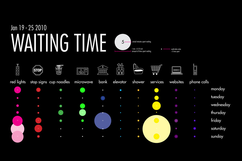
The history of video game controllers poster is designed by Pop Chart Labs. They have some other pretty amazing posters here.This poster by graphic designer Ruth Tsang illustrates how she spent her idle time. This is an example of a cute self promotion to give to clients and friends. 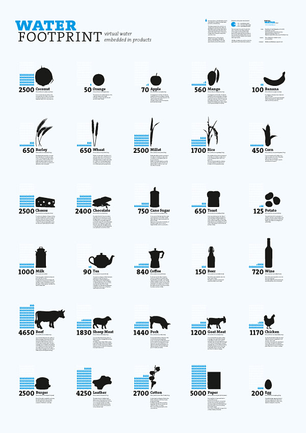 Here's an example of how infographic posters can be used for a good cause such as The Virtual Water Project. This infographic shows how much water is embedded in everyday products and foods.
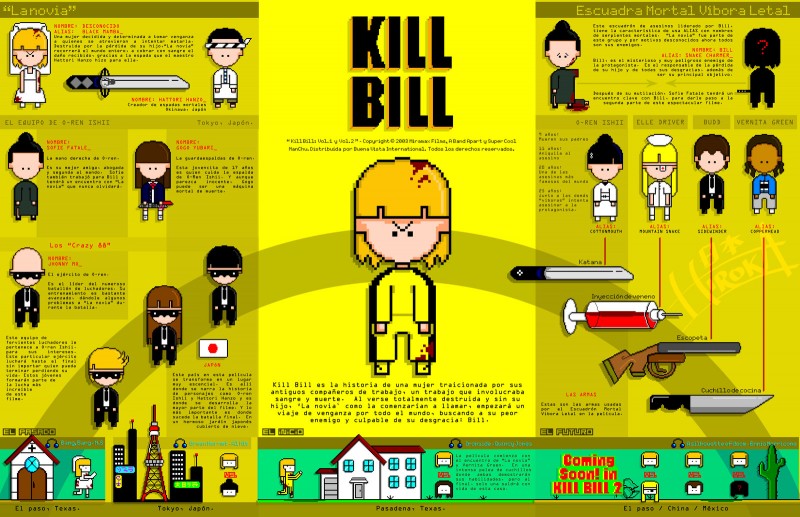
Wow. This is an amazing pixelated chart designed by Hirok-A, explaining the intricacies of the "Kill Bill" plot. Now how about designing one of these for "Twin Peaks" fans?  This image is part of artist Chad Hagen's nonsensical infographics series. These pictures are featured on www.20x20.com and exploit the beauty of great infographic design, minus all of that silly information.
 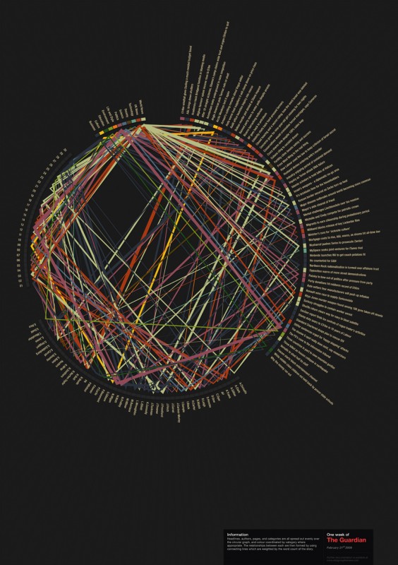 This poster shows all of the articles, headlines, writer and topics covered in one week of The Guardian. Featured on Designing The News.
 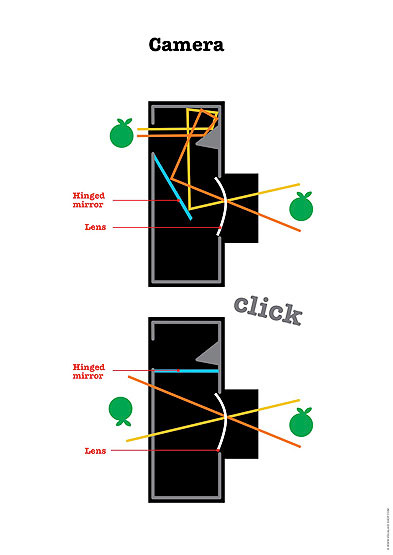 It can be hard to remember how a camera works. This poster by Visual Aid can help. Visual Aid has tons of inspirational examples of information graphics posters.
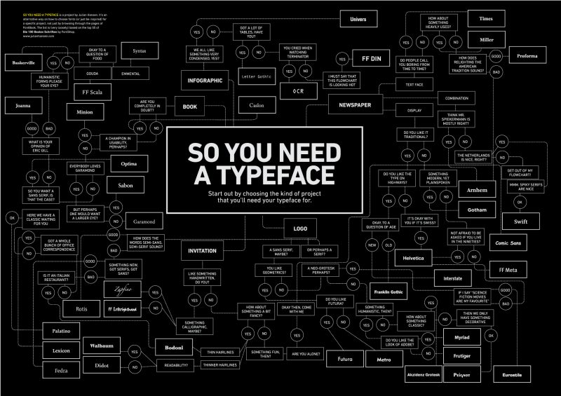
A flow chart for choosing a typeface. This is something that every designer could use on their office wall. Designed by Julian Hansen. 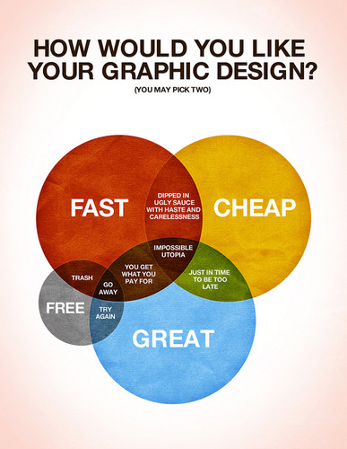 This is a great in-joke between members of the design community, but probably not a wise choice for a client-facing self promotion. The poster is designed by Colin Harman.
 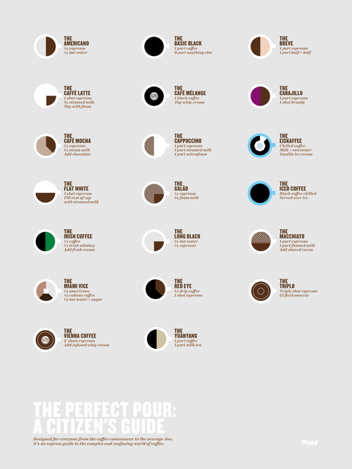 Mmmm. Coffee. This poster, "The Perfect Pour," is created by Plaid Creative and shows the correct ratios for making perfect coffee concoctions. Check out this post for more coffee design inspiration.
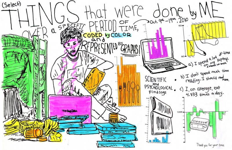
Wes Harbison came up with this amusing personal infographic. I really like the hand-drawn inllustrations and how he let's the graphics speak for themselves with very little qualifying text or numbers.
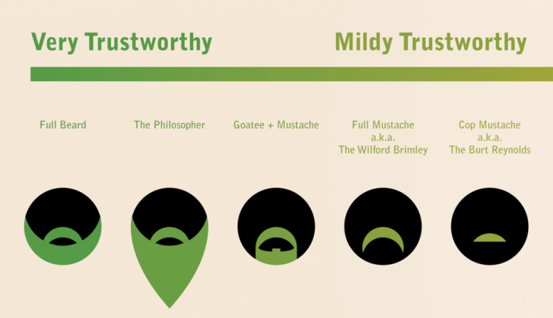
Here is an excerpt from Matt Mcinerney's infographic showing the trustworthiness associated with different kinds of beards and moustaches. The full version of the infographic is really quite funny.





Here's a related post on communicating through infographics: http://www.noupe.com/graphics/communicating-through-infographics.html
[...] Credits: [PsPrint] [felipitu's flickr [...]
[...] Credits: [PsPrint] [felipitu's flickr [...]
[...] Credits: [PsPrint] [felipitu's flickr [...]
[...] health, jobs, and politics – the following infographics present and transform what seems to be complex data into interesting bits of information that you can easily impress your [...]
wow..really nice