

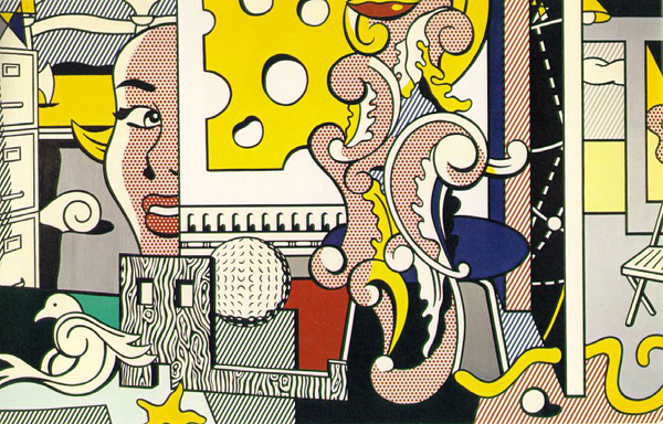
 Roy Lichtenstein's "Go for Baroque," 1979, in The Jeffrey H. Loria Collection, New York.
Ben-Day pattern Named after its creator, Benjamin Day, the Ben-Day Dot pattern was a way to apply shading to images. According to Wikipedia, "1950s and 1960s pulp comic books used Ben-Day dots in the four process colors (cyan, magenta, yellow and black) to inexpensively create shading and secondary colors such as green, purple, orange and flesh tones." So the evenly spaced Ben-Day Dot pattern (which is different from halftone dots in that they're all the same size and spacing and always round) is a hallmark of the comic-book style. Obviously, Lichtenstein (above), who pillaged the visual vocabulary of pop culture, imitated a Ben-Day Dot pattern in his paintings. 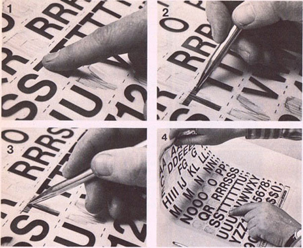 Here's an image of the process of transferring lettering by the same method as Ben-Day Dots. The pattern would be printed on a sheet of plastic. Once dry it could be transferred by turning ove the sheet and burnishing the ink onto a piece of paper. Koala Ranch Wine
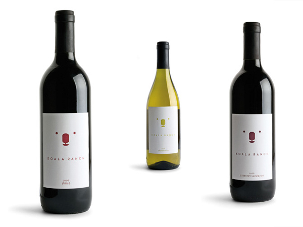
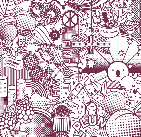
Koala Ranch (which, coincidentally, has the cutest logo for a wine brand) did some ads that use a Ben-Day Dot to give its one-color illustration some depth and shadow. (Images from http://www.behance.net/lindseyaho/frame)
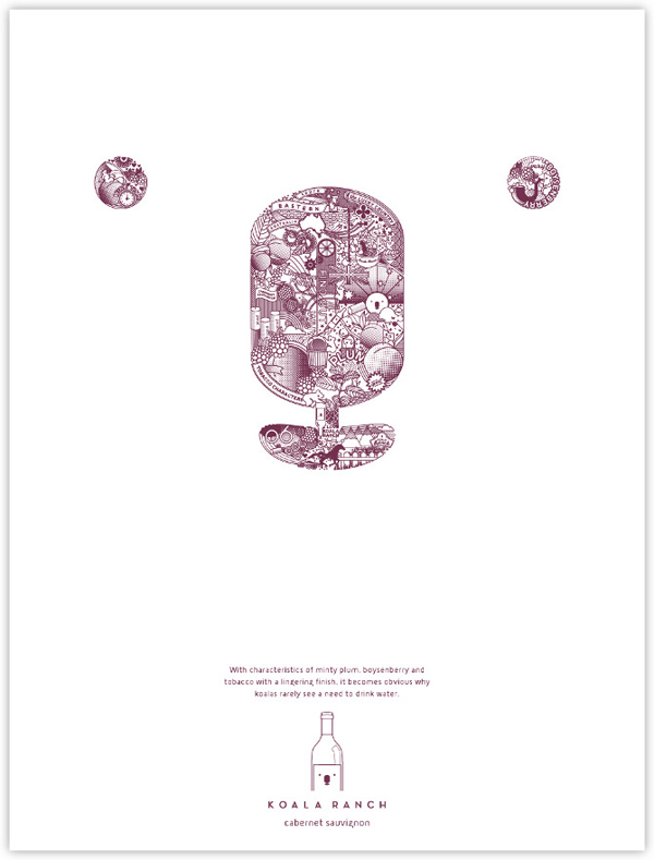
Here's a detail of some of the intricate wackiness that's going on inside of the illustrated logo.
Word/thought bubbles Naturally, anyone who's read the Sunday funnies as a child is familiar with the talk bubble (and it's cousin, the thought balloon). It's the easiest way to make a clear space for words within the confines of a busy or colorful illustrated panel.
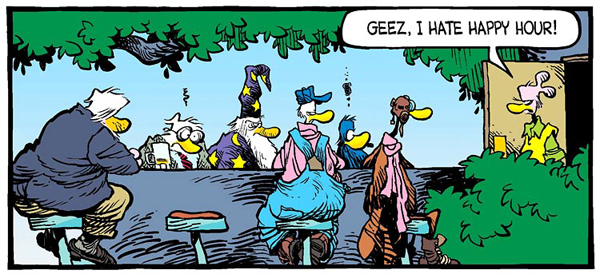 A single-panel installment of "Shoe" by Jeff MacNelly.
It's such a familiar device that we see it when we text and as shorthand for various forms of social media like tweeting.
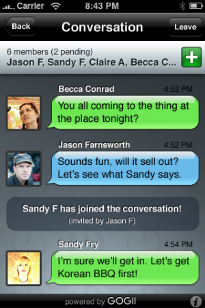 Example of textPlus app.
Smart conversation from Minted.com.
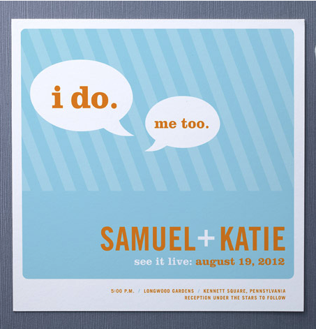 This cute wedding invitation from Minted.com takes advantage of the talk bubble to highlight the most important words of your special day. Thick black outline Since comic books were done cheaply on low-quality paper the art couldn't be done with fine lines. On newsprint the ink can bleed into the paper, destroying fine detail. And the boldness of the Ben-Day Dot for shading requires a thicker line to compete with it. Therefore comics were inked with a heavy line to ensure clean reproduction and clear differentiation between character and background (besides also adding a level of noir-ish intrigue).
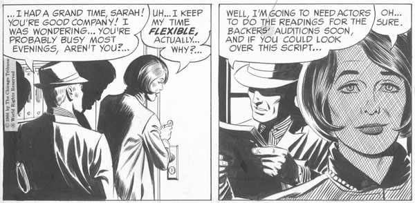 Panels by Leonard Starr who wrote and inked "Mary Perkins, On Stage."
Lady Gaga gig poster
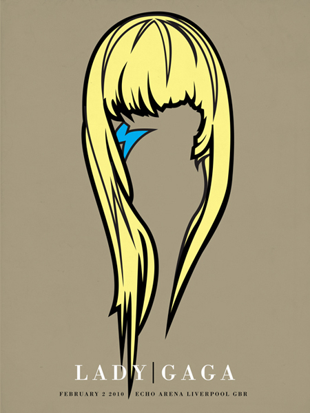
This gig poster by Aaron Gresham for a Lady Gaga performance is a great example of evoking the thick, inky black outline of '60s comics (back when comics where actually done with brush and ink instead of digitally). This poster also suggests a certain superhero persona by deleting every identifying feature except the blonde hair and face paint.


The Ben-Day Dots extend to Halloween costumes! http://twitpic.com/77y56w