Matte and glossy paper both have their pros and cons, and choosing one finish over the other can completely transform a design. So how do you decide on matte or glossy paper for a color business card or postcard printing project?
If you are unsure about whether to use glossy or matte stock for your next project, use the suggestions and examples below as guidelines.
Postcards
Glossy postcards are standard. Glossy paper will be the best choice for most postcard designs. Postcards usually have a large photograph or image on the front side, and a glossy finish will make that image crisp and clear to viewers.
If you do have a lot of text on the front of the postcard, then a matte finish may actually make the text easier to read. You can also do a gloss finish on the front to highlight images and matte finish on the back for increased legibility and a surface that's easy to write on.
If you want to use matte paper for a postcard, there should be a good reason for it. Perhaps you want to highlight that the card is printed on recycled stock. Or maybe you have a postcard design that includes foil stamping, embossing or a color combination that you think will stand out more on matte stock than on gloss.
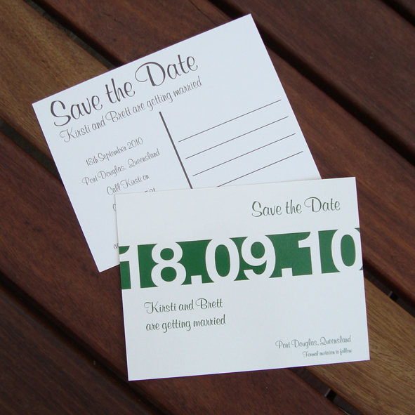
Today, many people use postcards in lieu of more formal greeting cards, for example, as a wedding save the date. If the postcard is for a special occasion like a wedding save the date, and you don't want the card to look too much like advertising mail, then a matte finish is a good fit. Matte postcards with script or serif font can also come out very nicely.
Business Cards
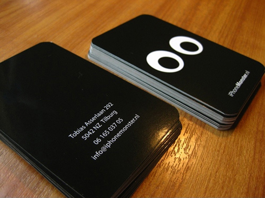
It can be very tough to nail down the right paper treatment for a business card design. For business cards that use a black or dark background with a white font, glossy paper can work really well to make the white font pop and make it more legible.
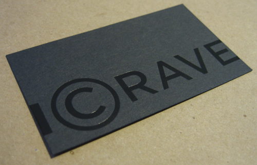
I also like when business cards have a matte paper finish and only the logo or the company name has a spot-gloss finish. This makes the one element on the card stand out and also draws attention to the thickness and quality of the matte paper.
For very traditional business cards on ivory or white paper stock, with a black or navy serif font, matte paper is the way to go. If you are ordering lots of business cards at once and don't know which finish to choose, do two separate print runs, one glossy and one matte, and see which treatment works better.


Thank you. It's very helpful.
btw, "...too much like advertising mail, than a matte finish is a good fit." The word "Than" should be "Then" :)
Thank you! I made the correction.
I do consider all the ideas you have presented on your post. They are very convincing and will certainly work. Still, the posts are too brief for beginners. May just you please lengthen them a little from next time? Thanks for the post.
[…] Postcards and Business Cards: Matte vs. Gloss Paper – When designing a business card or a postcard, how do you decide between glossy and matte paper? Here are a few suggestions to help you choose the right paper finish … […]