- Ivory soap just announced a packaging rebrand. Will it be one of the good ones?
I find it fascinating when a company with a familiar brand logo and personality decides to scrap it and reinvent itself with a new look. This craze to appeal to a different or broader audience can be fraught with peril. It's a rare thing to do well without upsetting both old and new customers and becoming a laughing stock. There have been quite a few in the past couple of years that missed the mark. And in the past couple of weeks the San Francisco Asian Art Museum unveiled its identity revamp to a less than enthusiastic reception, especially considering the gobs of money spent on the endeavor (about $400,000, according to The Examiner). That's a big investment for something that may not resonate with the general populace. It's maybe a little early to call it a failure. People hated the Transamerica building when it first went up, and now it's a beloved San Francisco landmark. Take a look and judge for yourself. Asian Art Museum redesign This new logo and identity was created by Wolff Olins, which notably created the logo for the 2012 London Olympics. This is what the agency had to say about what its intention was with the design: “The upturned 'A' says the Asian Art Museum is approaching Asian art from a new perspective,” explains Nick O'Flattery, strategy director at Wolff Olins. “It’s meant to be an attention-catching invitation to people, from art lovers to art newbies, to visit the museum and engage in this new perspective on Asian art. We discovered this later, but it’s fitting: In mathematics, an upside-down 'A' denotes ‘for all.’ This reflects the museum's desire to open to a wider community.” 
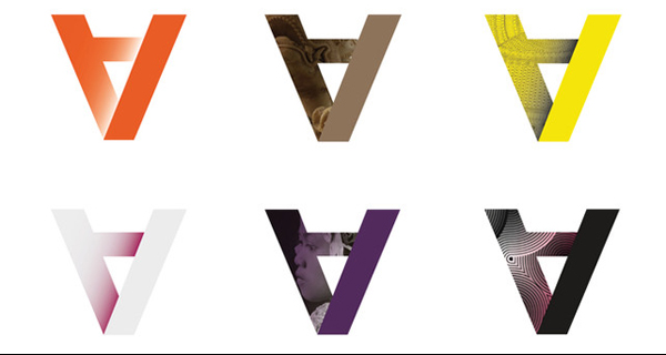
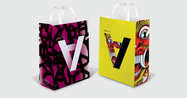
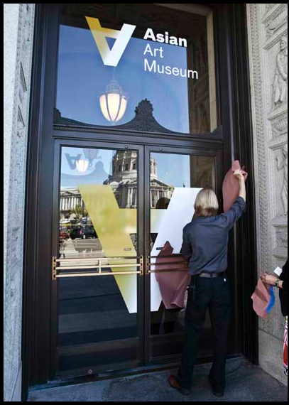 So it's an upside-down "A" with a gradient emanating from the last stroke. It may actually end up being more interesting in usage on packaging and other promo materials. You'll see below that it's meant to act as a container for imagery as well.
 Other questionable redesigns
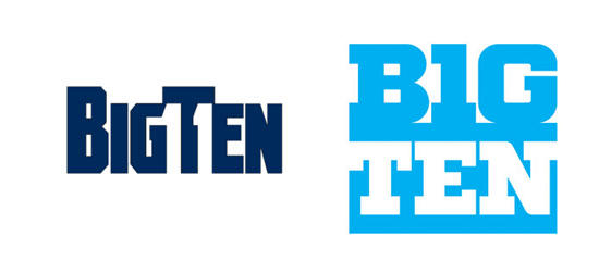 So the original Big 10 logo was clever because there were actually 11 teams in the division and the number 11 was hidden in the negative space under the "T." It was an elegant solution to incorporate the truth of the current situation without having to rename a conference with a lot of heritage. The new logo was faced with more or less the same problem. The conference had expanded once again to 12, so the old 11 logo couldn't be used anymore, but the conference still wasn't going to be renamed. So instead of trying to work a 12 into the name it just turned the "i" in "Big" into a 1 so that the "ig" could also be read as a 10. This was designed by Pentagram, a venerable and much-respected design firm. And it solved the problem of having to continually redesign with each expansion, but the logo was met with a tepid response.
 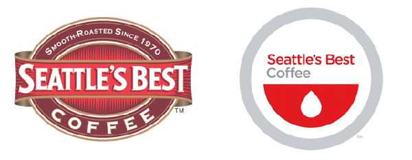 The general consensus was that with the color change to gray and red the new logo looked like it was for a blood bank rather than a coffee brand. Enough said.
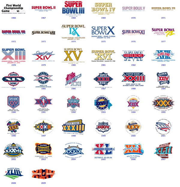
 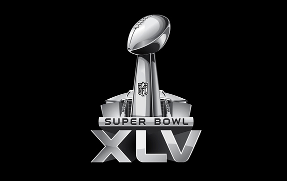 From now on the Super Bowl logo will be the Roman-numeral year, topped by the hosting stadium and the Lombardi trophy and always in a chrome finish. Boring and sad. Compared with the diversity of the past 38 years of logos it seems like a lazy approach.
 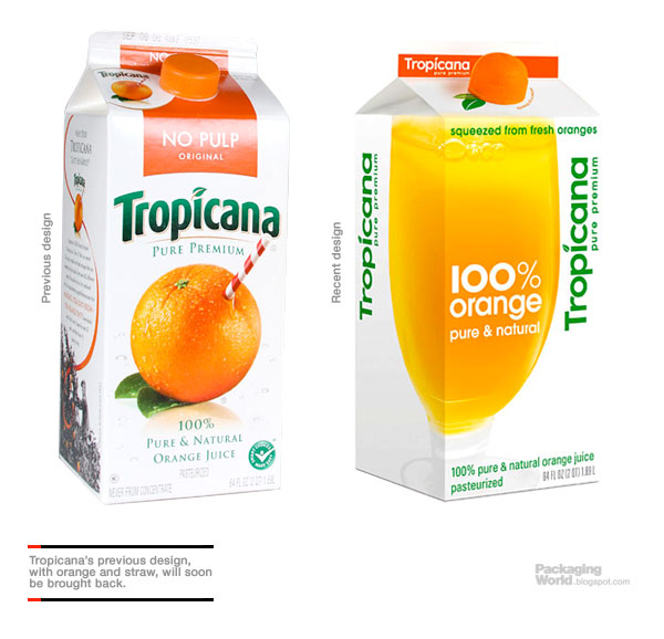 Maybe the biggest fiasco in recent rebrand memory was Tropicana juice. Sales dropped by 20 percent when the new designed rolled out. After less than two months Tropicana returned to the old packaging. While I'm not personally offended by the new packaging besides the fact that it looks like a generic store brand, there were a lot of functional elements that were stripped away. One of the most widely criticized was that the variety of juice (in instances when it was a combination of orange and pineapple or high pulp, etc.) was not signaled anywhere but in the small strip across the top, which was easy for consumers to miss, making it more likely that they would accidentally take home a variety they didn't intend to. There's a really good, thorough criticism of the ineffective element of the new brand here on Astuteo.




[...] Good and Bad Redesigns – change isn’t always good. PsPrint.com analyzes corporate logos and their success (or lack thereof.) [...]
I have to admit, I was severely upset with the Tropicana redesign, but it has kind of grown on me now, and I actually sort of enjoy the clean look more now than the busier packaging (despite the iconic straw in the orange branding).
The Ivory soap redesign is interesting in that I feel like the reasons behind the redesign are not very clear. Ivory's old branding always felt to me personally like it was particularly focused towards women (as opposed to soap like Irish Spring which is clearly targeted at a male audience), and it does appear that they are continuing that trend, so I am unsure exactly why they felt the need to rebrand if they are still targeting the same demographics. Perhaps they are trying to ellicit a new generation with brand loyalty, but do they dare risk doing so by alienating their existing customer base?
Rebranding politics is pretty fascinating :)
[...] a mistake. While most consumers don’t care that much when a container or logo changes, this time sales actually took a hit. That is what drove the company to go back to the classic design just months after releasing the [...]
[...] While most consumers don’t care that much when a container or logo changes, this time sales actually took a hit. That is what drove the company to go back to the classic design just months after releasing the [...]
[...] a mistake. While most consumers don’t care that much when a container or logo changes, this time sales actually took a hit. That is what drove the company to go back to the classic design just months after releasing the [...]
[...] a mistake. While most consumers don’t care that much when a container or logo changes, this time sales actually took a hit. That is what drove the company to go back to the classic design just months after releasing the [...]
[...] identity designers have achieved fame by crafting some of the best-known big brand logos, but there are many other talented designers out there who are perfectly capable of creating [...]