Brochures are actually one of my favorite items to design. I love the detail and planning that goes into creating an eye-catching brochure design. But I’m always impressed when I see another graphic artist take a brochure design idea to the next level. Tri-fold brochures are great and serve their purpose, but brochures don’t always have to be limited to looking like a template. The next time you approach a brochure design, try to think of a way that you can make your client’s design stand out among the rest. Not just in your design work, but in the brochure printing as well. Here are 10 brochure designs that go outside of the tri-fold box: 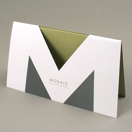 This sleek design by Shannon Rose uses the "M" letter shape as inspiration with a clever die cut.
 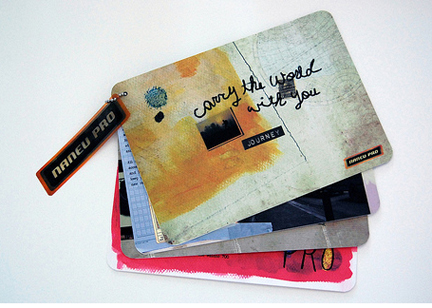 This unique brochure by Anais Lee uses a fastener in one corner giving a whole new page orientation.
  This brochure by Adcetera, Inc. uses another great die cut on its cover. It not only looks great, but highlights the company logo beautifully.
 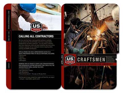 This industrial-looking design by Power Creative works great with the brochure's subject matter.
 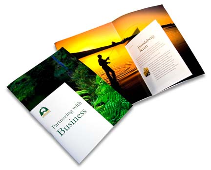 A beautiful design by Minus Front that includes smaller page inserts. A brochure within a brochure.
 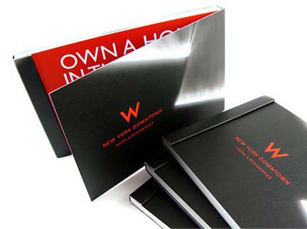 This contemporary design by Best Design Options has a creative fold on the right side instead of the traditional left.
 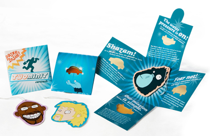 This eye-catching campaign by There Was A Stick Man includes a brochure where four panels open to display its content.
 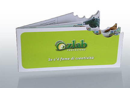 This brochure's die cut is very appealing. Looks like someone took out a great big bite out of this brochure by Ozlab!
 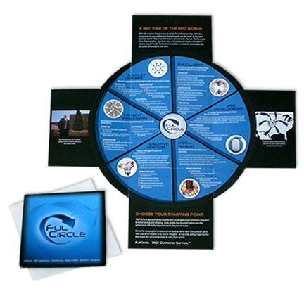 This brochure by William Parton has a unique fold out as well. Look at how small the folded version turns out to be.
 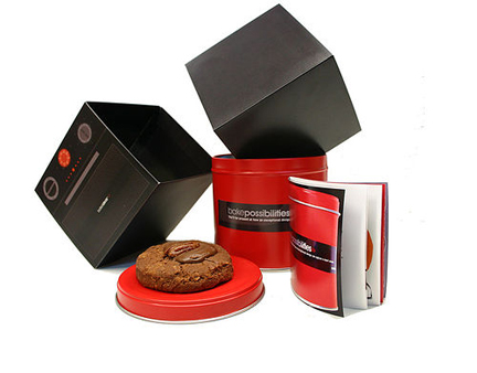 This great brochure design by Design Site Setup is folded in such a way that it forms a box. Perfect for storing cookies!
10 Cool Brochure Designs
April 27, 2010




Wow, what an inspiring collection!
These brochures look really good. Tons better than I could do !
I had my nursery rhyme book converted into an electronic brochure as well as having it printed. it looks really professional. This was the company that did it. http://the-web-shop.org.uk They are very good.
Thank you! We're always looking for inspiring designs so keep checking back with us!
BORING!
I love william partons brochure design. Very inspiring.
[...] roadster cartier santos cartier santos 100 cartier sunglasses cartier tank cartier tank watch cartier trinity b4052700 uk cartier trinity [...]
[...] 10 cool brochure designs10 Cool Brochure Designs. By. Valerie. Published: April 28, 2010. Brochures are actually one of my favorite items to design. I love the detail and planning that … [...]