

A lot of designers out there believe less is more. Minimalist color business cards, with very few elements and colors, are becoming more and more popular.
The logic is: the cleaner the design, the more impression the business card makes. But sometimes a card design can become too minimal, leaving out vital information or clues as to what exactly the person on the card does for a living.
While it may seem cutting edge to just center your name and phone number in sans serif font, how will anyone who receives your card remember that you are a designer or web developer or zookeeper .... you get the point.
Below are some crisp, minimalist business cards and comments about whether they properly communicate the occupation and personality of the professional:
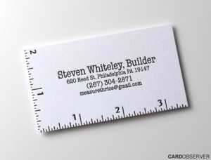
I like this one because of its use of a two-color design and a single typeface. The ruled border show's just enough personality and relates back to the person's occupation. Image via Modny73.com. 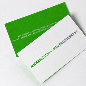
A good reminder that minimalist doesn't always mean grayscale. This green-and-white design is upbeat and memorable. Image via Itevenhasawatermark.com.
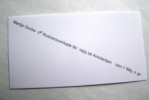
This card has a very playful use of whitespace and is interesting to behold. The only down side, there is not enough information about what this person does. Image via [Re]Encoded.com. 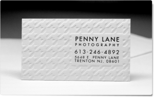
Imagine how fun it is to hold this card in your hand and feel the texture of the debossed pattern. Very elegant solution. Image via TasteofInkStudios.com.
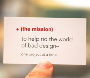
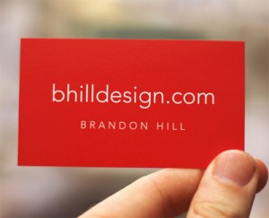
The simple use of red on this card really pops, and so does the playful message. Image via Cardonizer.com.
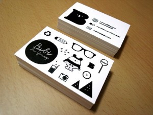
Do you think this one is minimalist? With one color and the use of simple icons, I believe it qualifies. This card suggest the person has a creative job, but it's hard to tell because there's not very much information given. Image via PremiumBusinessCards.org.


love the letterpress, however, i feel that none of these cards are truly minimal. being that business cards are for contact purposes, the minimum amount of information needed would be name + telephone/email/pager etc., the advertising should be left to the personality of the individual who is issuing the card.
my $0.02
Thanks Ian- I always like to hear other people's opinions!
Cool Stuff. I have been checking out a lot of business cards and have seen some pretty gimmicky stuff. It is fairly refreshing to see this type of work highlighted.
I recently had some pretty cool biz cards done by a "green" Graphic Design Team. They do their printing in house which helped me lower my costs. If you want to look at some of their business cards check out their Blog its got some pretty cool stuff. Cheers!