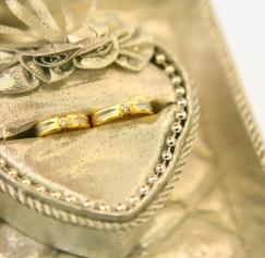
Business cards are still the most widely used form of marketing there is. Even with PDAs and cell phones, the business card is the quickest and most transportable form of information around. So what should you advertise in such prime real estate to be noticed? Just like any other strong marketing material you need to keep in mind the basic principles of design when laying out your business card. You used to have consider how much money you were willing to spend before you could figure out how many colors you were going to use in your business card design.
Author Archive |
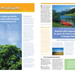
You’ve created this wonderful design for the company newsletter. The boss loves it. In fact she loves it so much she wants it done every quarter. It already took you three hours to put it together, and you dread loosing three hours every quarter to create it all over again because it means another late night at the office. Adobe has thought of this in their infinite wisdom and has built template and style sheet features into their programs. Our example is a newsletter so we will use InDesign to explain these features. First look at your design, see our sample below.
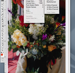
So, you’ve come up with a really great design for your new business card, brochure, flyer, ad, etc., but your printer requires you to supply a print-ready file. In this segment we will detail what exactly that means. No matter what program you used to create your file there are certain components it must have to be print ready.
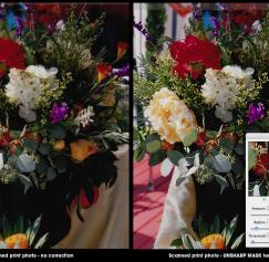
Everyone hates bad photos, especially soft or fuzzy photos. They stand out like a sore thumb when printed, especially if it’s used in an ad that could be right next to a competitor’s ad with flashy studio photography.

Images are the spice to good design. They can enhance your message and hold your audiences attention. If used properly a good image can create many different designs. Used too much or cropped poorly and it can sour the whole layout. In this segment we will look at how one image with the way it is cropped can be used in a variety of ways. Overall image Let’s take a look at our image below.

In this segment we will identify the elements of a page. This can apply to any page in a publication whether it may be a magazine page, book page or newspaper page they all use some or all of the elements we will be reviewing. When designing a page it is important to keep all these elements in mind when laying out a page.
Let's define what the “live area” is and why it is important to design within this area when designing for print. So, what is the fabled “live area?” The live area is the area in which your printer deems a safe zone for important text or images. This is an area of your printed piece that they can deem safe from cropping.
You placed an order for 2,000 double-sided glossy brochures, and you told the printer you would send them the artwork. Your printer said, “Great just make sure you send us a 300 dpi EPS file.” Stricken with panic you reluctantly chime, “OK, no problem.” While you know what an EPS file is, you are wondering what dpi is and how you can find out if your EPS file has it.
When designing something for non-personal use, there are a few things you should keep in mind. You don’t want to get slapped with a lawsuit because you decided to use a pretty picture you found online on your business cards. Of course, this information is not exhaustive and is provided to give you an idea of what to avoid when looking for content to use in your designs. What is a trademark? Names, words, logos and designs used to identify services or products are considered trademarks or service marks.
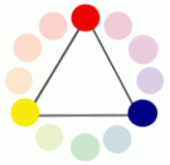
Color theory basics – part 2: Color wheel relationships and groupings So now that we know from Part 1 that artists typically use red, yellow and blue primary color groupings (see color model below), what are the other color wheel groupings known as? [caption id="attachment_135" align="aligncenter" width="135" caption="Red, yellow and blue make up the primary colors."]<img class="size-full wp-image-135" title="primary color wheel" src="/sites/default/files/2
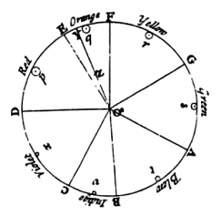
Color theory basics - part 1: Subtractive vs. additive color The color wheel - By definition a color wheel or color circle is an organization of color hues around a circle, showing relationships between colors considered to be primary colors, secondary colors, complementary colors and so on. Color theory is a set of principles used to create harmonious color combinations.
Pages
What is the PsPrint Blog??
The PsPrint Blog is a resource for graphic designers, freelancers, small business owners and fans of print marketing. You'll find helpful techniques on printing everything there is to print, including business cards, postcards, brochures, stickers, invitations, greeting cards, door hangers, magnets and more. The PsPrint Blog shares creative ways to improve your design and layout skills, and useful tips for marketing your business in any medium. We also like to have a little fun, sharing design inspiration and spotlighting some our favorite customers' printed pieces in our "Hot Off the Press" series.


