

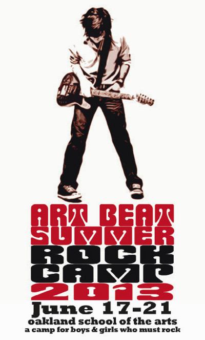
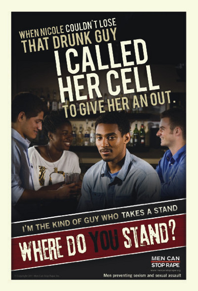
 A quick glance at this week’s printing orders reveals a common theme: There’s a lot of red and black in these designs. It reminded me of a popular PsPrint Blog post that Brian Morris recently wrote about choosing colors for print marketing. A combination of red and black is considered “excellent,” with red suggesting “excitement” and “urgency” and black symbolizing “power.” I believe this to be true, because one look at the postcard Misisipi Mike Wolf – not a typo! – designed for the Art Beat Foundation’s Rock Camp makes me want to pick up a guitar and jam. The postcard campaign by Men Can Stop Rape also grabs attention with its striking red and black design and bold typography. How much consideration do you place into color in your designs? Do you think color affects purchasing decisions? Have a look at this week’s “Hot Off the Press” – last week’s, too, which had Chowdaheadz’s particularly powerful red and black “Boston Strong” sticker – to find design inspiration and see how the different colors and combinations make you feel.
Postcard design by Misisipi Mike Wolf for Art Beat
Business card for Hachi Supply

Postcard design by Men Can Stop Rape
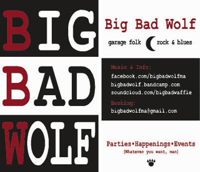
Front and back of business card design by Max Larson for Big Bad Wolf
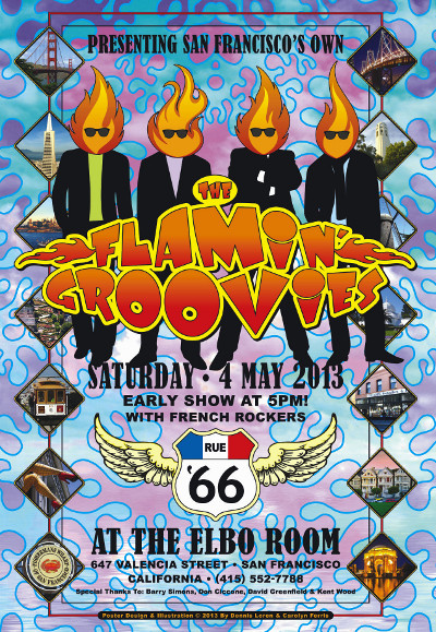
Poster design by Dennis Loren and Carolyn Ferris for the Flamin’ Groovies
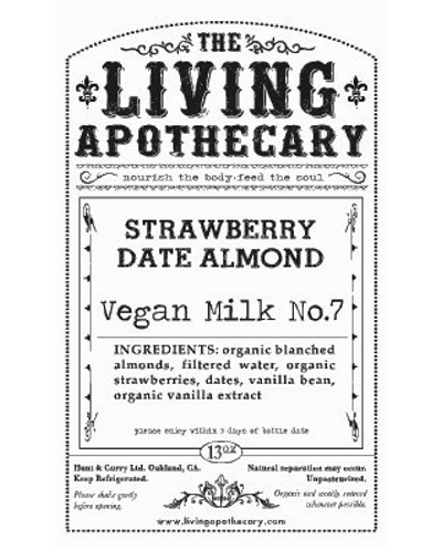
Sticker for The Living Apothecary
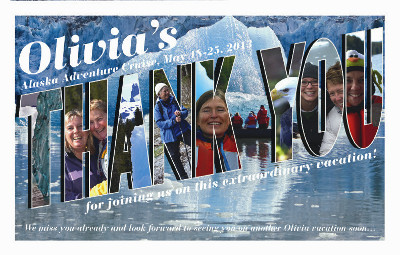
Postcard for Olivia Travel
Back and front of business card design by Molly Eckler for Communique Interpreting

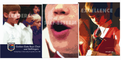
Postcard for Golden Gate Boys Choir and Bellringers
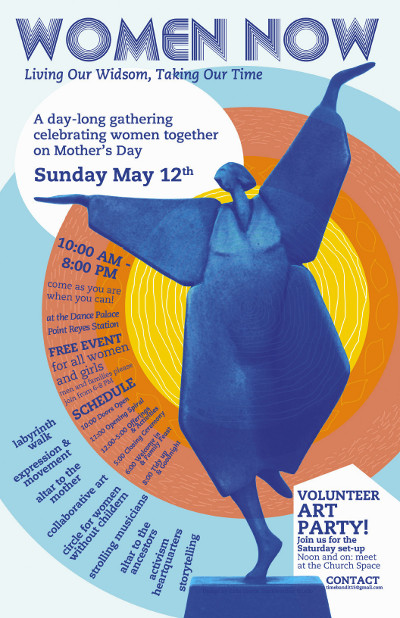
Poster design by Starkweather Studio’s Katie Eberle for Women Now
Catalog cover design by Stephen Crotts for RUF Summer Conference

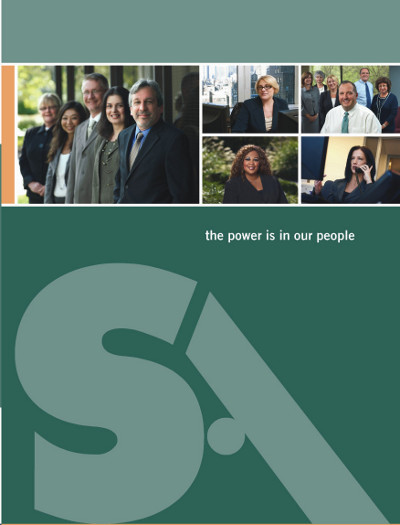
Pocket folder cover design by Helen Azzinnari for Savoy Associates
Canvas backdrop design by Damian Walker for Tradavo

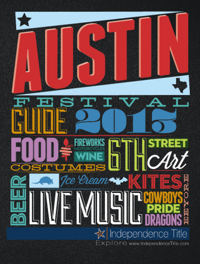
Front of Austin Festival Guide design by Logan Lloyd for Independence Title Co.
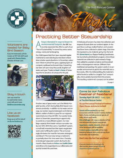
Newsletter by Nine Design for The Bird Rescue Center


I really like the rock camp poster, and the "men can..." poster is very well-designed!