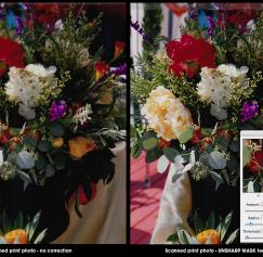
Everyone hates bad photos, especially soft or fuzzy photos. They stand out like a sore thumb when printed, especially if it’s used in an ad that could be right next to a competitor’s ad with...
Printing
You could have the coolest design ever, but if you print it incorrectly and on flimsy paper, then you’re doing a disservice to your design. Perhaps you are planning on printing flyers to promote your business, but maybe door hangers would be the better option. These are just a few of the useful tips you will find in these PsPrint Blog posts below covering all aspects of printing. Whether you are printing a small sticker or a large vinyl banner, we’ve got a blog post that can help you.
Images are the spice to good design. They can enhance your message and hold your audiences attention. If used properly a good image can create many different designs. Used too much or cropped...
In this segment we will identify the elements of a page. This can apply to any page in a publication whether it may be a magazine page, book page or newspaper page they all use some or all of the...
Let's define what the “live area” is and why it is important to design within this area when designing for print.
So, what is the fabled “live area?” The live area is the area in which your...
You placed an order for 2,000 double-sided glossy brochures, and you told the printer you would send them the artwork. Your printer said, “Great just make sure you send us a 300 dpi EPS file.”...
When designing something for non-personal use, there are a few things you should keep in mind. You don’t want to get slapped with a lawsuit because you decided to use a pretty picture you found...
Read Part 1.
Let's cover a few basics.
Choose a portfolio that will accommodate a 17-inch-by-11-inch...
This is a question I hear often for designers entering the design field for the first time. Many have little of no “real” work to put in their portfolios. Here is my advice: You should include 10...
Color theory basics – part 2: Color wheel relationships and groupings So now that we know from Part 1 that artists typically use red, yellow and blue primary color groupings (see...


