

A big weakness in logo design is when all the logos in a particular industry start to look the same. This happens a lot with companies who greenwash in an effort to brand their company as "environmentally friendly."
Since the purpose of a logo is to send an immediate message to the viewer about what the company or brand is, I guess you can argue that the sameness of logos within an industry could be a design strength, too. At least when you see a logo with a green tree, you immediately think "Green," so all of those similar environmental logos, do meet that requirement really well.
Another industry where the logos are becoming super-homogeneous is in social media. In this post, I've rounded up the social media logos that I think look very similar to one another. I enjoy using many of these sites! This critique is purely from a design perspective.
In part two of this blog, I will highlight the social media logos that I think stand out as unique and are really brandspirational, a word I just made up, but you get the point.
Without further ado, here are some of the similar social media logos. Try to divorce yourself from the familiarity of these logos and evaluate them again with fresh eyes. What do you think? Why do they all look so similar? If you could redesign them, what would you do differently?
- What's blue, sans serif and recognized all over? All of these logos!
- Think about what Twitter does: How unique it is in terms of social media, and how unique its logo COULD be.
- Flickr, Facebook and Linkedin all look so similar. The only variation is the way the type is blocked out of a colorful background, or Flickr's pink "r."
- With all the logo-based icons that social media users interact with each day, you'd think these brands would want to stand out, not blend in?
![]() Foursquare is a newer social media platform that uses geo-positioning to make help mirror a users' real social life online. Actually, Foursquare is more complicated than that two-bit description I just gave. The company has another version of its logo (shown below) with a boy or a girl ready to toss a ball, a reference to the children's game of foursquare.
Foursquare is a newer social media platform that uses geo-positioning to make help mirror a users' real social life online. Actually, Foursquare is more complicated than that two-bit description I just gave. The company has another version of its logo (shown below) with a boy or a girl ready to toss a ball, a reference to the children's game of foursquare. 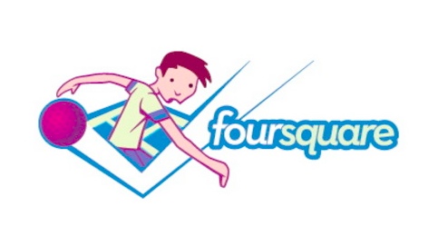 This version of the logo has a lot more going for it in terms of originality. The drawback is that the children's game of foursquare has no concrete connection to the social media application (just a conceptual tie-in). I know that compared to Groupon, another newer social media start up, Foursquare has less traction in growing its user-base. Maybe it's because outside of major urban areas, folks don't seem to know what Foursquare is. Try and explain Foursquare to someone who's not "checking in" to the local cafe every day. Meanwhile, I don't think the Foursquare logo is really doing much work in the way of answering the "What is it?" question. What do you think about these social media logos? If you were entering the social media sphere with a start-up, what would you do differently in terms of logo design?


[...] part one of this post, I talked about social media logos that look the same. I just wonder why when it comes to social media, and many online companies, [...]
[...] design annuals and magazines for inspiration, they risk falling into the trap of imitation and sameness. Sometimes a corporate client will prefer a “safe” design. But if a client wants to [...]
Because the web – social media's native environment – all these logos need to be identifiable as sizes as small at times as 12px tall. The only one of these brands that has a symbol successful at this is Twitter, whose small bird is pretty ubiquitous around the web. At such sizes, having a logo that's easily legible should be a requirement. In all these examples you can see how bold and black the letterforms are. Again, that's because they'll be seen at tiny sizes, every so often.
Also, most social media phenoms start out with good products THEN put good branding into place. Mostly because the people doing this don't have the money. Recently, communities like Forrst, Tumblr and Dribbl pop up with great branding... because great designers are the heads of these start-ups. However, many up-and-comers (like Diaspora) still have crap looking branding. MySpace, if people still even remember it, took years to have something that even looks half-good. There's plenty of well-branded social media sites with hardly any users out there.
Lastly, I think it's wrong to think that a good logo even needs a good symbol to pair with it. There are a myriad of brands out there that all use Helvetica in different arrangement, with no symbols, that have identities as strong as the day they were commissioned in the 60's and 70's.
It's not how well designed your logo is, per say, but how well it is APPLIED. In that regard, I'd say that all but FourSquare have very strong identities.
[...] (Related: In the past I’ve written about homogenous-looking social media logos.) [...]