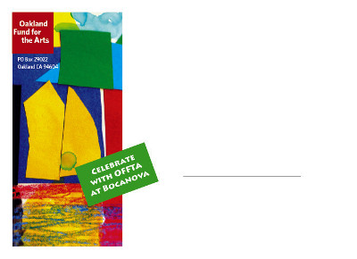
 As I was gathering images for this week’s “Hot Off the Press,” I noticed something similar among the designs: The best printing this week is so colorful! Some designers – and smart marketers – are way into color, and they consider when working on projects how it makes people feel and influence their decision-making. I’d never known too much about the science of color, so I created a Pinterest board devoted to palettes, infographics and inspiration. There you can find pins about how to choose colors for logo design, which shades provoke which emotions, which nontraditional wedding colors go together and more. This week’s collection of inspiration includes envelopes designed by Sally Landis for Oakland Fund for the Arts. Why a creative envelope, you ask? Because in today’s world of digital communication, snail-mail needs to find a way to stand out, and this colorful envelope is eye-catching – recipients won’t miss it among boring bills and circulars. Scroll through the rest of the designs here and make note of which colors stick in your mind. Looking for more design inspiration? Don’t miss last week’s “Hot Off the Press,” which featured brewery printing and cute animals.
Hot Off the Press: Oakland Fund for the Arts, Yoga Alliance and More
July 17, 2013
Planning for October: 15 ideas for your business's marketing planPrint marketing: 7 benefits to leverage in your business











No comments yet.