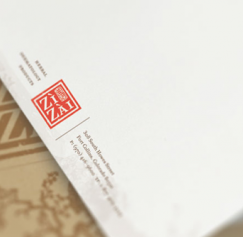
In my earlier post Letterhead Possibilities, Part 1, I gave some thought to the fold, the back of the page and the idea of wrapping around. But there are so many other considerations since you have to...
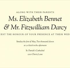
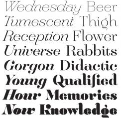
In my previous post, "Great Font Combinations for Your Wedding Invitations", I broke up the typographic styles into classic, modern and quirky. I'd like to delve a little further into each style. Toda...
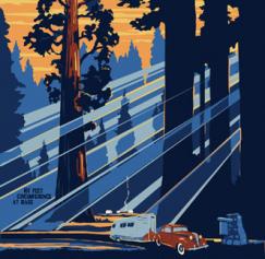
There's just something about vintage illustrated travel posters. They're a great source for vintage color palettes and typography if you want to recreate the feel of something printed in the 1930...
A letterhead system is an important communication tool for your company, or (if you're an army of one), yourself. At its most basic the system should include letterhead, envelopes and business cards....
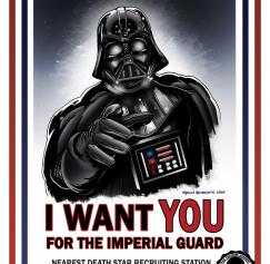
As a nod to Memorial Day I'd like to dig up some great old American military propaganda posters. You'll instantly think of the Uncle Sam poster or Rosie the Riveter. That's a testament not only to the...
Like correct spelling and grammar, there are certain details in typography that make you look polished and professional instead of sloppy and amateurish. While it’s easy to run a spell check it may no...
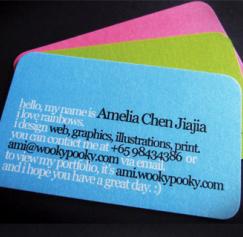
Last time we talked about type on business cards in Part 1, the ideas were pretty basic. Choose a distinctive font; use the different type styles from one big-family font; and use type at smalle...
In honor of the Maker Faire this weekend, and all the DIY, crafty, garage-born businesses that will be selling wares, I’d like to take a moment to talk about stickers. Yes, stickers. Stickers are your...
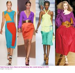
Fashion trends change with the seasons, and wedding trends follow right behind. Now seems like a great time to take a look at some of the biggest spring trends and use the ideas to make your invitatio...

