
![]()
A fairly recent revamp of a long-time San Francisco Bay Area newspaper flag.

![]()
A fairly recent revamp of a long-time San Francisco Bay Area newspaper flag.

It's not every day that your entrance is accompanied by a fancy, printed announcement. Between the power of home computing; a proliferation of crafting books, websites and TV shows; and a desire to save money, more and more people are designing and/or creating the birth announcements for their children.
![]() Muni's iconic "worm" logo was designed by Walter Landor in the 1970s and is still with us today.
Muni's iconic "worm" logo was designed by Walter Landor in the 1970s and is still with us today.

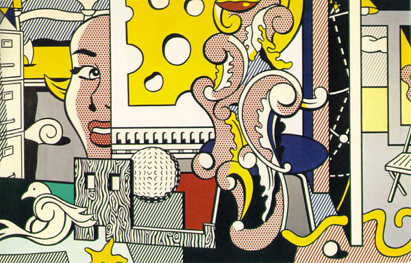 Roy Lichtenstein's "Go for Baroque," 1979, in The Jeffrey H. Loria Collection, New York.

An Esquire-styled display window at New York menswear store Paul Stuart.

It's important to keep track of these things. (Image via Joe Stone.)

This is the month of Oktoberfest so it seems only fitting that we honor the humble beer label. There's a lot of history in beer label designs. Some conventions, like a ribbon to show award-winning quality or apothecary-like wordiness, are centuries old. I've found some off-the-beaten-path interpretations of beer labels to serve as food for thought.

 Entertainment Weekly had a great slideshow on fall TV show posters (from which I found most of these images). I clicked through to see if there was anything inspired going on.

I find it fascinating when a company with a familiar brand logo and personality decides to scrap it and reinvent itself with a new look.

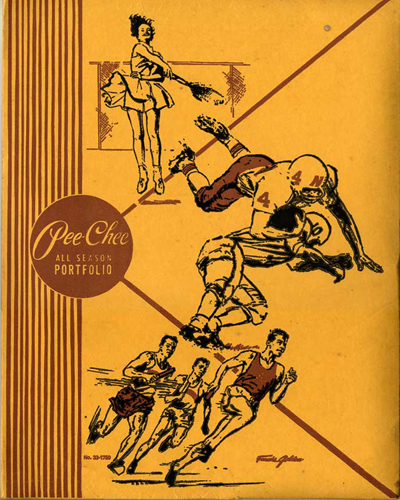
Ah, Pee-Chee, my old friend, how thoroughly defiled you were every year.

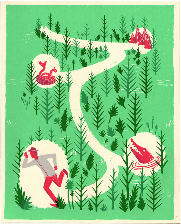
This piece by Adam Hancher for Tiny Showcase shows how a little texture and imperfection in the flat color makes it more interesting.
 of Money")
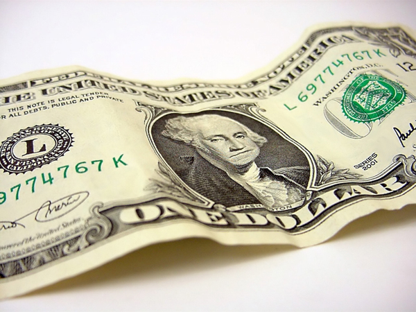
Our boring green money
The PsPrint Blog is a resource for graphic designers, freelancers, small business owners and fans of print marketing. You'll find helpful techniques on printing everything there is to print, including business cards, postcards, brochures, stickers, invitations, greeting cards, door hangers, magnets and more. The PsPrint Blog shares creative ways to improve your design and layout skills, and useful tips for marketing your business in any medium. We also like to have a little fun, sharing design inspiration and spotlighting some our favorite customers' printed pieces in our "Hot Off the Press" series.


