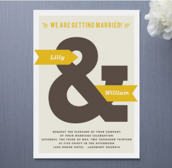
As more and more non-traditional couples tie the knot, the traditional rules of etiquette and ritual get neatly tossed out the window. Couples have non-church weddings in all manner of settings — at ranches and cabins, scenic lookout points, concert venues, nightclubs, warehouses. If you can think of it, a wedding is being planned there. So sometimes the formality of a snowy-white engraved invitation isn't in keeping with your wedding/yoga retreat, or your casual "We're Hitched!" BBQ. That's where quirky wedding invites come in.
Rosana Mojica
Author Archive | Rosana Mojica
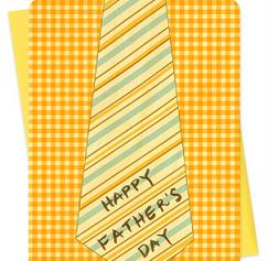
A Father's Day card can be a tricky thing. So many cards are jokes at dad's expense. He's either portrayed as an obsessive, a tactless lout or an incompetent boob. We know that dads can be a complicated and varied lot so it can be hard to get the sentiment just right and make it seem personal. Father's Day should be a time to appreciate dad for who he is. There are some funny, touching and graphically beautiful cards our there waiting for you to pen a simple message on them.
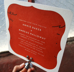
Weddings are more personal and reflective of the bride and groom than ever before especially since so many couples are doing more DIY projects to save money on the exorbitant cost of getting married. Some brides want the big poofy dress and romantic fairytale but more and more brides are getting married later in life and realize that they don't want to make it as big of a fuss, or brides are getting remarried and don't want to repeat the lush, romantic wedding they had the first time around.
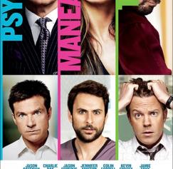
Summer movie season is kicking off and movie posters can act as great inspiration. If you're making flyers for an event or stumped on fresh ideas for promotional posters there are some ideas you can steal from Hollywood. The posters I've picked out are not chosen for the quality of the movies or because they're the biggest blockbusters.
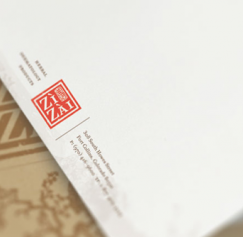
In my earlier post Letterhead Possibilities, Part 1, I gave some thought to the fold, the back of the page and the idea of wrapping around. But there are so many other considerations since you have to include a multitude of bits and pieces and design for both vertical and horizontal layouts. So the meat of your letterhead, namely, the contact information and company logo have to be flexible and modular.
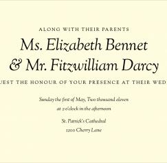
In my previous post, "Great Font Combinations for Your Wedding Invitations", I broke up the typographic styles into classic, modern and quirky. I'd like to delve a little further into each style.
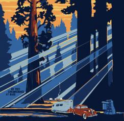
There's just something about vintage illustrated travel posters. They're a great source for vintage color palettes and typography if you want to recreate the feel of something printed in the 1930s and '40s. The following six are vintage Works Progress Administration posters of National Parks from the '30s.
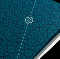
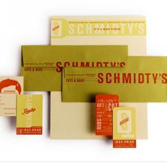
A letterhead system is an important communication tool for your company, or (if you're an army of one), yourself. At its most basic the system should include letterhead, envelopes and business cards. It can include much more than that, but we'll cover that later. A letterhead system makes you look professional and reputable, but it can be a challenge to design for yourself. The problem and the opportunity are two sides of the same coin.
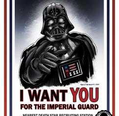
As a nod to Memorial Day I'd like to dig up some great old American military propaganda posters. You'll instantly think of the Uncle Sam poster or Rosie the Riveter. That's a testament not only to the original image and its impact and staying power, but also to the many homages and parodies those images have spawned throughout the years. Lately there has been a resurgence of propaganda-style posters used to comical effect by inserting a pop-culture reference.
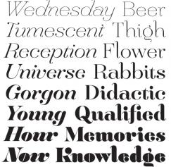
Like correct spelling and grammar, there are certain details in typography that make you look polished and professional instead of sloppy and amateurish. While it’s easy to run a spell check it may not be as cut and dry to fine-tune your typography. Here are a few baseline tips to keep you looking sharp. 1. Use “smart” quotes and apostrophes. Smart quotes are also referred to as curly quotes, unsurprisingly, because they are curved (or, in same cases, slanted.) Straight quotes look more like tiny, un-dotted exclamation points.
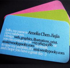
Last time we talked about type on business cards in Part 1, the ideas were pretty basic. Choose a distinctive font; use the different type styles from one big-family font; and use type at smaller than usual sizes. Of course, there’s so much more to designing a business card than that. So now that you've picked your font and started playing with type styles and sizes lets try out some more ideas.
Pages
What is the PsPrint Blog??
The PsPrint Blog is a resource for graphic designers, freelancers, small business owners and fans of print marketing. You'll find helpful techniques on printing everything there is to print, including business cards, postcards, brochures, stickers, invitations, greeting cards, door hangers, magnets and more. The PsPrint Blog shares creative ways to improve your design and layout skills, and useful tips for marketing your business in any medium. We also like to have a little fun, sharing design inspiration and spotlighting some our favorite customers' printed pieces in our "Hot Off the Press" series.


